Showing posts with label Inkylicious Ink Dusters. Show all posts

Thursday, 21 June 2018

Card and Present for a Centenarian

On Saturday we are going to a party to celebrate a friend’s 100th birthday. She is a truly remarkable lady and you’d never guess she was this old! She gets out and about and joins in everything, and is a real character. I really wanted to make her something special for her birthday but didn’t have much time to do it, so this week I’ve pulled out all the stops and really cracked on, and at last I’ve finished, bar a few finishing touches.

The Card

In February I went to the Craft4Crafters craft show in Exeter, and bought some lovely dies by Die’sire (Crafters’ Companion) – these are supposed to be to create easel cards but I thought this lady might not know how to work them, so I decided on doing a straightforward card for her, using most of the elements. I chose the gorgeous butterfly card set.

Here is the topper in the early stages. I forgot to photograph every stage, but I chose some paper and card from a wonderful collection that a friend gave me for my birthday – she was so delighted that I was already starting to use them. The base layer is a dull gold card with bright gold text, “Congratulations” all over it. I chose a piece of green and white floral card for the next mat layer, and on top of this, a decorative paper with pink roses on a green and white background. These two mat layers were cut with the two frame dies from the set, and I distressed the edges of the top layer with distress inks and a bit of water spattering.

Here’s a more detailed shot. Originally I was going to use one or both of the wide ribbons in the previous photo but on further consideration, thought they were a bit too wide, so I chose a narrow pink organza ribbon, and a slightly narrower green satin one with a picot edge instead. I also selected a few flowers left over from the Floral Mini-Album project, which would tone in nicely with this card.

I selected some sentiment pieces from my stash, which I had cut some time ago on Sheba, my Cougar cutting machine. I coloured the text pieces with Worn Lipstick Distress Stain, and the shadow pieces I first coloured with Dried Marigold Distress Stain to give a nice rich base colour, and then added Treasure Gold gilding wax.

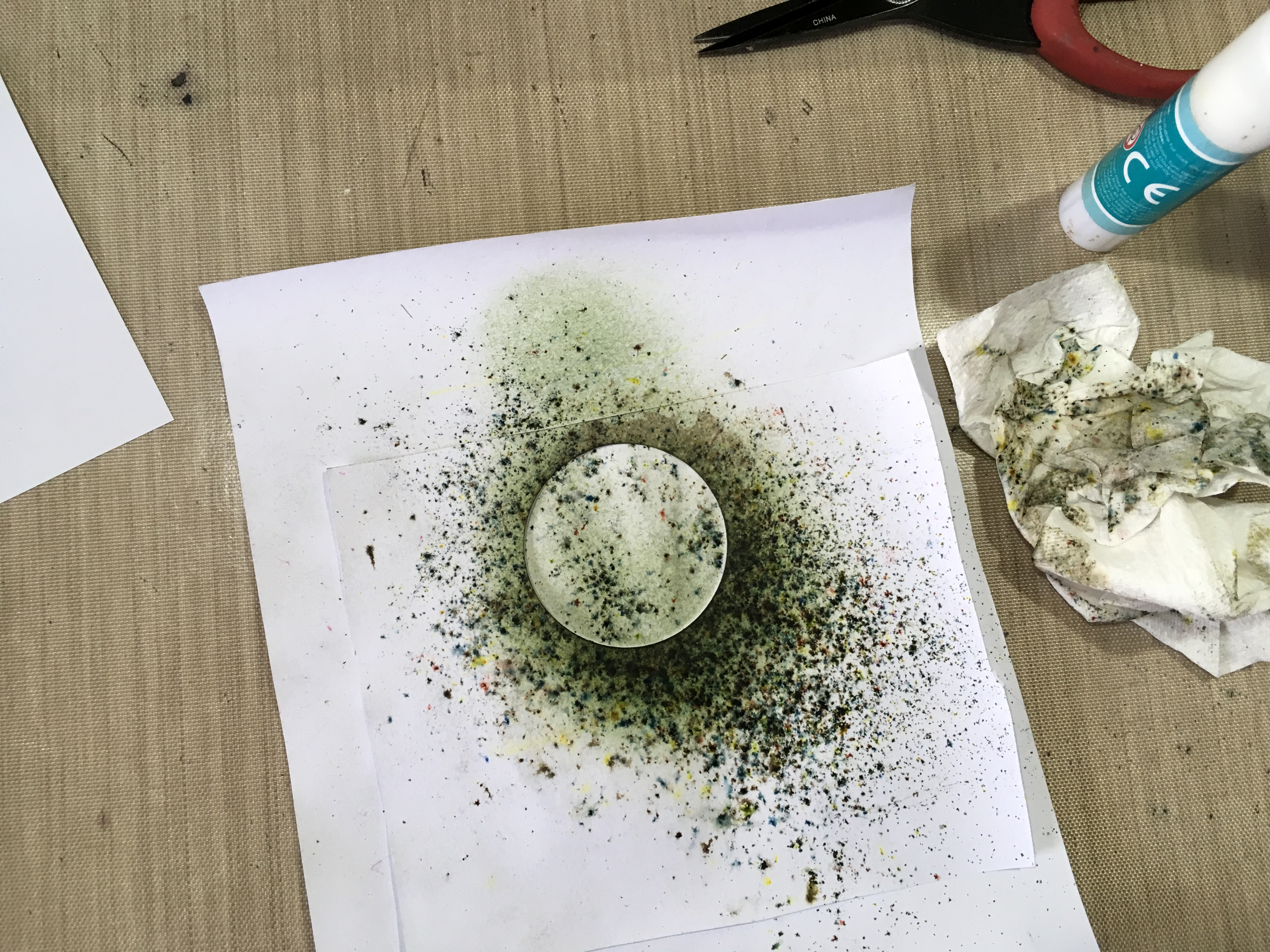
I layered the pieces, sticking them together with spray adhesive. Behind, you can see my home made spraying booth.

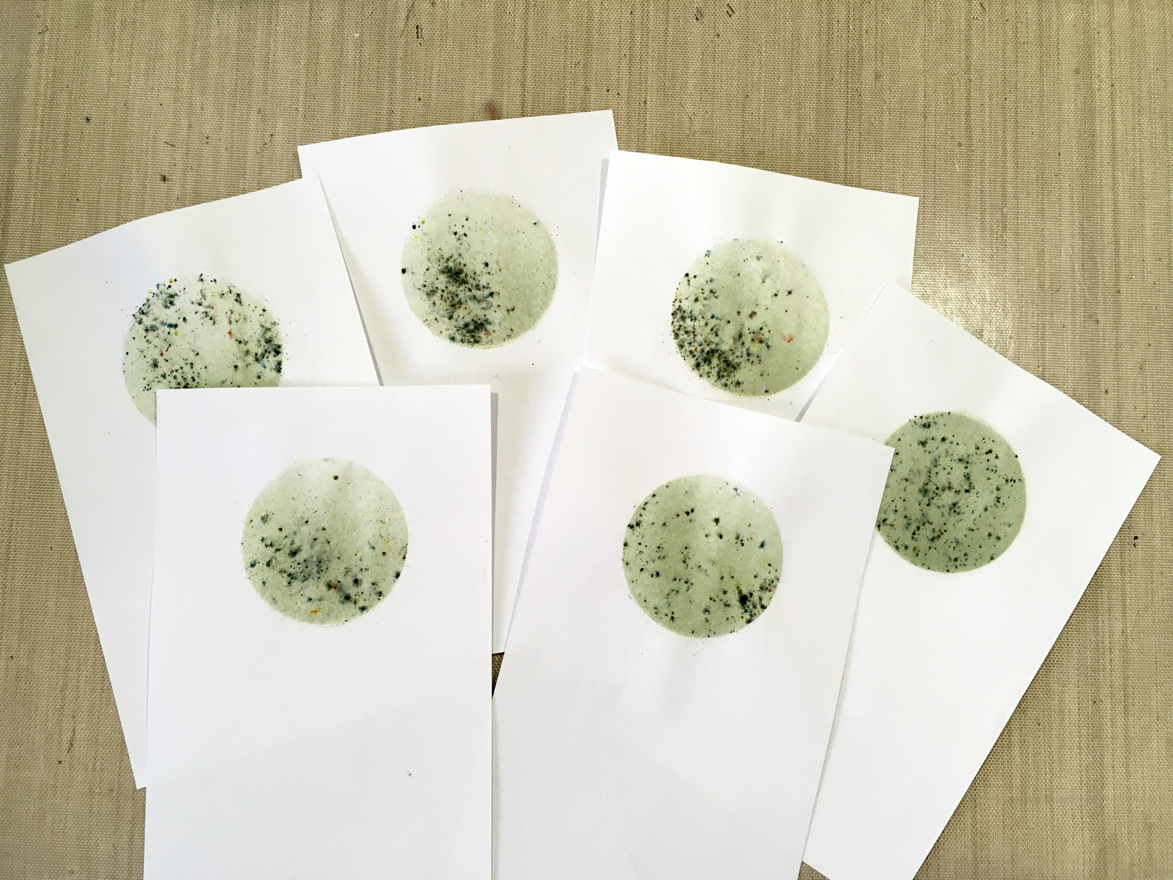
Turning to the inside of the card, I coloured it very lightly, using Inkylicious Ink Dusters and Distress Inks, first working in from the edge with Evergreen Bough, and then covering the whole of the middle with Antique Linen. After this, I stamped a selection of butterflies with Versamark and heat-embossed them with clear embossing powder. I then continued to colour the paper, first with Old Paper Distress Ink, and then a little Spun Sugar, concentrating on the areas where the embossed butterflies were. I rubbed these with very slightly damp kitchen paper to remove any ink from the embossing, and added some water spatters which I allowed to sit for a minute or two before blotting them off. The final touch was to add a bit more distressing around the edges, this time with Bundled Sage Distress Ink and a home-made ink blender.

The result is quite subtle, I think, and the embossed butterflies echo the theme of the card.

Here is a mock-up of the front of the card with all the elements laid in place.

The two little leaves were from my stash. Every now and then I cut a whole sheet of different elements on Sheba, from white card, and store them away, ready for when I need them, and I can colour them individually according to the project. This time I used Bundled Sage Distress Stain.

To add a bit of interest, I daubed a little Forest Moss Distress Stain onto my craft sheet and with a very fine wet brush, added a deeper colour to pick out the veins of the leaves. I spritzed them lightly with water and blotted them to soften the effect a little, and then dried the leaves with my heat gun. They were stuck down with Scotch Quick Dry adhesive.

Here is the finished card with the final elements added. I left it out overnight to allow the glue etc. to dry.

Before attaching the topper to the base, I attached the two layers of ribbon, fixing them on the back of the gold “Congratulations” card with double sided tape, and attaching a small piece of each, folded over to form two tails, with glue dots. The top of this was covered with the paper flowers, which were attached with hot glue. The leaves were stuck down with Scotch Quick Dry Adhesive.

The butterflies in the die set all have the ability to have their wings folded upwards, and whenever I do this, I always add a blob of Pinflair glue gel under each wing to keep them up and stop them getting flattened. This glue dries crystal clear and you really don’t see it. It also doesn’t lose any dimension as it dries, making it ideal for uses such as this. It is a very three-dimensional glue.

I added a few dots of Holly Stickles down the bodies of the butterflies, and in the centre of the smaller pink flower. Both the Pinflair and the Stickles glitter glue need time to dry before they can be handled. Unfortunately the Stickles dry a lot flatter than they appear when first applied, which I think is a shame because I love the 3-D effect you get with them when they are wet.

I stuck down the sentiment on the front of the card and inside, using Scotch Quick Dry Adhesive.

Now all that remains is to cover a box that I’ve got, which will serve as an envelope – the whole thing is rather thick, with the roses and the raised butterflies’ wings.

The Present

A small cross-stitch plaque with the word “Shalom” in Hebrew and English letters. The tall stroke of the Hebrew letter “lamed” extends to become the English “L”. I worked this cross-stitch with two strands of stranded cotton on 22-count Aida fabric, working in the small clip-frame which has a hanger on the top.

Beside it you can see the original one which I made for myself.

When this photo had been taken, I had completed the cross stitch but had not yet done the outlining back stitch in black, using a single strand of stranded cotton. This really helps the design stand out against the background, as you will see if you compare the two plaques.

I created the original design on a programme called EasyCross, several years ago. Unfortunately this software does not work fully with Windows 10. I was able to print out the design (top right in the above photo) but the colours weren’t right, and it was covered with very distracting diagonal dotted lines. I ended up colouring the background with coloured pencils to show me where to change. Before I did this, I found I was making numerous mistakes, and the bottom half of the design had to be fudged a bit but it’s worked out OK. The graduations between the rainbow colours were achieved by mixing threads on the needle – one strand of each colour. In the original, I worked alternate stitches of each colour for the transition, and I can’t decide which I prefer.

I have bought a new cross-stitch designing programme called WinStitch (there is also an Apple version called MacStitch). Unfortunately the old EasyCross files won’t open in this programme but at least I can print out my original designs and copy them into the new programme. This will take a long time but it will be nice to have them available again. I haven’t done any of this for such a long time and now feel I want to take it up again, and I was very pleased to find that an alternative programme exists to replace the now defunct EasyCross. A shame this programme has been discontinued because it was very good indeed.

Here is the completed plaque.

This is the reverse.

To finish off the back, I trimmed back the edges of the embroidery fabric and glued it to the inner ring of the frame with tacky glue, leaving it to dry for a while, held in place by a series of plastic clamps that I’ve got.

I stuck some cream polycotton fabric onto a piece of self-adhesive pelmet Vylene and used the inner ring of the frame as a template to make a paper pattern to cut it out. Unfortunately I had to cut this by hand and it’s a bit shaky round the edges! I think what I need to do is to scan the inner ring, and use this image to create a template in Inkscape, which I can cut on the cutting machine, which would give a much neater result.

To neaten it a bit, I ran some tacky glue around the junction between the two frames and stuck on some gold Lurex crochet thread, finishing it off with a small bow that I made on my bow maker. This was stuck down with a tiny blob of Pinflair gel adhesive, and again, this was left to dry overnight. I have also signed the back and dated it.

I am busy tomorrow morning, but I have every hope that I shall finish off this whole project in the afternoon, and get it wrapped ready for the birthday party the following day.

Sunday, 8 April 2018

Floral Mini-Album Pt 5 Working on Pages 4 and 5

Recently I made a new mini-album, about my mum who died in December. I was unable to publish anything about this until now because it is a present for her best friend, who sometimes visits my blog, and I wanted it to be a surprise for her. I wrote a series of blog posts as I did each stage of the project, so I didn’t forget what I did, and they will be published in sequence now the project is finished and has been given to our friend.

If you want to see the finished project, please click here.

Starting work on another double-page spread today. This one is to have a musical theme.

I began with the second page, page 5. I placed the Tim Holtz music mask over the page and gently applied three colours of Distress Oxides with an ink blender. I used Broken China, Worn Lipstick and Peeled Paint. This is the first time I have tried the Distress Oxides on black paper and they really do work well.

The next photo shows the Distress Oxides having been spritzed with water, with the mask still in place.

The mask removed. I am pleased with how sharp the outline is.

There were some problems with this, though. Firstly, it was much too strong and dark, and secondly, this mask really annoys me because it isn’t proper music. I do wish when people design stuff like this, that they would consult someone who knows, if they themselves don’t know – the designer of this clearly doesn’t know anything about music! It’s the only mask I’ve got (maybe this is a hint-to-self: get on with it and make one yourself!!) so I made do with it, and thought that if I made the effect more subtle, the fact that it’s wrong would be less noticeable. There will probably be some sort of mat or flap over the top anyway, which will partially conceal it.

Here it is with a second layer of Distress Oxides having been applied, spritzed and dried. Already it looks better.

The final touch was to add some infusions to produce a bit of texture. These work very well with Distress Oxides – it’s the first time I’ve tried this combo. I used Royal Blood and The Sage from set 1, and Magenta from set 2.

I may put some sort of border around this. I had thought of using some Tim Holtz tissue tape that I had in my stash and hadn’t even opened. I attempted to use it, but this stuff is a total pain – it is very thin, and ultra sticky, and when I eventually found the end and tried to unroll the tape, it constantly ripped along its length, and was impossible to use. It has gone in the bin. Do not waste your money on this stuff!!! I was amazed because most of his stuff is such good quality. I googled the problem and found that I was not the only one who has experienced this difficulty with it. In the end I left the page as it was.

I then moved back to page 4 and made the pocket mat. I cut this from plain white cardstock and stamped it with a music background stamp. I laid the card strip onto the stamp platform an inch in from the edge, so that I wouldn’t get the edge of the music on the card, but a borderless effect.

It took some experimentation, and proved quite difficult to do because the card was longer than the stamp, and it meant doing several trial runs on scrap paper after I’d stamped the top half, in order to line it up and get the spacing correct, and when I moved the stamp down further on the stamp platform, it projected over the edge, so I had to press it down hard and hope for the best – that it would produce a decent impression, and also that it wouldn’t fall off mid-way through! All was well in the end. I stamped the pieces using black archival ink, and the stamp I used was “Music Background” from the Artistic Stamper.

Again, this looked much too stark, so I inked it with a combination of Distress Inks, using Inkylicious Ink Dusters, in Broken China and Victorian Velvet, and afterwards distressed the edges with Forest Moss, using a DIY ink blending tool.

For the mat for the remainder of page 4, I used some of the paper from the stack, and again distressed the edges with Forest Moss distress ink.

Here is page 4 with both mats stuck down.

This is the double-page spread of pages 4 and 5, laid onto the cover with pages 1 -3. I have not yet decided what to put on the flap of page 5, but underneath there will be a piano keyboard pop-up.

Once the basic structure of the pages is complete, I can think about the inserts, photo mats, envelopes, pull-outs, etc. etc.

Monday, 12 February 2018

Pop-Up Valentine Card for my Hubby

Recently I found a video on Youtube with a number of pop-up designs for Valentine’s and I thought it would be fun to make one for my hubby. This time last year I was in hospital for Valentine’s and didn’t make him one, but he gave me the biggest one I’ve ever seen, and all the hospital staff thought it was brilliant!

Anyway, this year, I’ve managed to escape being in hospital for Valentine’s although I am waiting to go in, so there’s no excuse for not making one for him this time!

I began by making the simple pop-up mechanism from white cardstock.

This is the outside of the pop-up, folded. You can see some of the construction lines.

I thought I would use some of the scraps from my mystery project for this card. Here they are, being smooshed with Fired Brick Distress Ink. This particular paper is an absolute pain to ink because it seems to have rather a waxy surface that resists liquid, and it takes ages to dry with the heat gun, too, but it’s a paper stack I’ve had from the very beginning, and I’ve never liked it much, so I thought it was high time I used it up, especially that nowadays I’ve got enough experience to know how to improve it.

For the pop-up piece, rather than leaving it stark white, I smooshed it with Worn Lipstick Distress Oxide to give a marbled effect.

After this I distressed the edges with Vintage Photo Distress Ink – I thought that a touch of brown would prevent the card from looking too girlie.

I also distressed the sides of the pop-up, masking off the surrounding areas with some scrap paper.

Then I took one of the inked scrap pieces and cut it into half-inch strips, which I wove in and out of the pop-up to create the basket.

When the weaving was finished, I trimmed off the bottoms of the strips, and left the tops at random lengths.

I have only got one heart punch, and it makes very small ones. I punched out quite a few from one of the scrap pieces, punching them as evenly as possible so that I could use the waste piece to embellish the front of the card. Then I made some intermediate and larger hearts, drawing round a little template I made and then fussy cutting them.

I also cut some hearts from some scrap gold card to mat the hearts, and also added stickles (gold and orange peel) to some of the hearts, and began to glue them onto the pop-up with Scotch Quick Dry Adhesive.

I punched the corners of the pop-up with my multi-shaper punch. It’s not designed as a corner punch, but with some careful lining up, I was able to achieve the result I wanted. I also distressed these punched corners with Vintage Photo Distress Ink to match the rest of the pop-up.

At this point I forgot to take any photos for a while. I mounted the pop-up on some pink cardstock, and on the outside, front and back, I added some red cardstock that I distressed around the edges with Vintage Photo Distress Ink, and I also added some of this ink in the centre with an Inkylicious Ink Duster. I layered a heart cut from a scrap onto more of the scrap gold card, and this embellishment was mounted in the centre of the card with a large foam pad.

I attached the punched heart strip onto a piece of gold card using Scotch Quick Dry Adhesive, and then applied the whole embellishment to the red mat with double-sided tape, folding the excess punched layer around the back, before matting the whole thing onto the pink card base.

Here is the completed pop-up, with cut and punched hearts on the woven strips and also stuck down onto the back of the pop-up to give a dimensional effect. I hand-wrote the sentiment.

Finally, the completed card with the envelope I made from more of the pink cardstock, using my envelope punch board.

The edges of the envelope were distressed with Vintage Photo Distress Ink.

Monday, 20 November 2017

Backgrounds with Infusions, Inks and Gesso

Returning to my Card Factory for this year, over the last couple of days I have made some backgrounds using gesso with infusions, and distress inks, and have die cut circles from some of these backgrounds.

The materials used to create the gesso backgrounds.

I spread gesso onto a piece of A6 card with a palette knife, and immediately sprinkled on a mixture of Slime and Rusty Car Infusions from set 2, and spritzed it lightly with water, and brayered over it, which spreads the infusions into parallel streaks. This is the sample at top left. There was quite a mess on the desk so I brayered this on to the subsequent cards, adding Infusions as I went. The colour gradually got more blended with the gesso with each subsequent sample and all are useable and slightly different.

The finished samples.

I mopped up the rest of the mess onto an A4 sheet and added more gesso and Infusions as required. For this sample, I brayered over the top of the right-hand side of the sheet and left the other side to dry naturally.

This is the final mop-up sheet, with further Infusions added, but no additional gesso.

These two A4 sheets can be used in other projects.

From the four small A6 samples, I die cut two different sizes of circles and also some larger circles from some printed card I had in my stash.

I am keen to use up quite a bit of stuff that’s been hanging around for years – much of this card is far too brightly coloured for my taste now, or not of a pattern or design that I am that keen on, being part of sets I bought many years ago. With a bit of treatment they can look perfectly reasonable.

I cut a piece of orange card 5 inches by 10 inches and folded it in half. You can see the original colour on the scrap underneath the background piece.

I applied gesso all over, using a foam brush. This left a lot of unsightly brush marks, so I spritzed it with water and then blotted it with a crumpled up piece of kitchen paper. I applied more gesso and repeated the process until I was happy with the result.

I heat dried it, and then stamped it using the Artistic Stamper Harlequin stamp (C349) without an acrylic block, stamping fairly randomly and taking care not to press the whole thing down each time. I stamped using Iced Spruce Distress Ink, and then distressed the edges with Aged Mahogany, using a home-made ink blender.

In the above photo, you can see the matted die-cut circles laid on top. This circle will be stuck down in the centre and the card base folded in half, and I will stamp something on the die cut circle and/or add some form of embellishment.

Moving on to the next piece, I took a piece of yellow A4 card and folded it to A5, In the following photos you can see its original colour, and the results of toning it down with gesso and inks, giving a much softer and more subtle effect.

I applied the gesso, again using a foam brush, but taking care to use only vertical and horizontal brush stokes, and then spritzed it lightly with water. Once I’d heat dried it, I used the same harlequin stamp, this time with Tattered Rose Distress Ink. Using an ink duster I added a bit of Cracked Pistachio Distress Ink randomly, and finally distressed the edges with some Aged Mahogany Distress Ink (visible on the photo above). Again, you can see the die cut circles chosen to go with this particular sample.

I decided to create a different background without gesso on another piece of the yellow card. For this one, I blotted off the Iced Spruce on the harlequin stamp, over most of the surface of the card until the stamp was clean. Then I added a small amount of Slime Infusions (from set 2) and repeated the stamping process, this time using another Artistic Stamper stamp: Calligraphic Mat #12, us9ing Aged Mahogany Distress Ink.

I applied a little Hickory Smoke Distress Ink with an ink duster, and also some Milled Lavender, both with an ink duster and with a home-made blending pad to distress the edges somewhat. Finally I added a small amount of Blackcurrant Infusions from set 1, randomly here and there.

Here are the three backgrounds so far, with the die-cut circles not yet glued down. I am not sure how I am going to embellish these yet, but they will all need the heavy book treatment to flatten them out properly before then.


Monday, 16 October 2017

Card Factory 2017

My stash of cards had pretty well run out so I really had to get down to making some more. I’ve decided I don’t really enjoy card making that much, so it’s a bit of a chore but I haven’t quite got to the stage when I’ve given up altogether and resorted to buying them!

Rather than falling into my usual trap of turning each card into a major work of art and taking far too long over it, I kept these ones simple. I shall continue to make special cards when the occasion demands, but the limited time I have available to spend in the studio (dictated by busyness elsewhere, and being too fatigued to do anything) is now dedicated to art projects I actually want to do, such as mixed media, books, experimenting with materials, etc.

Today I made seven cards. Six were more or less identical and were on a production line basis, and the other was a one-off which I made for our neighbour whose birthday is today.

I really struggled with these! Such a simple project, but if anything could go wrong, it did… I was feeling a bit brainfogged which really doesn’t help, and I made quite a few mistakes which were not able to be remedied unless I started again, so I pressed on. As a result, they are not my best effort!

I began by making a circular mask. Rather than setting the cutting machine up (couldn’t be bothered – too tired!!), I cut a 2-inch circle with a punch, which of course had to cut quite near the edge of the paper, so I stuck this with a glue stick to a larger piece, out of which I had cut a rough circle, larger than the punched circle. This is the back of it.

Turning it over, it provided enough margin not to allow anything to stray beyond the edges.

I had a couple of abortive attempts. I sprinkled Infusions (The Sage from set 1) through the mask onto two of the sheets I’d cut for the card toppers. In order to get enough coverage, they came out much too dark to stamp on. The one on the right was slightly lighter, and I thought I’d run over it lightly with a wet brush to make the texture smoother, but this was a disaster. Bin time.

It was hard to know what order to post the photos in, because in order to photograph the process I went through, I had to get ahead of myself a bit – I used the first successful circle as a guide for the rest. Here it is on my light panel, ready to use as a guide.

I lined up the next sheet over it, and you can just see the circle showing through.

I was then able to lay the mask on top. I had to do it this way because the mask was bigger than the small sheet and I had no way of lining it up otherwise.

I’d decided the only way I could get the effect I wanted, with good coverage of colour but with a little of the Infusions texture, was to ink the circle first with distress ink using an Ink Duster (I used Bundled Sage), and then add the absolute minimum of Infusions on top. This worked well.

Here is the distress ink going on, through the mask.

I picked up the whole thing and without disturbing it, carried it back to my main work area and sprinkled on the Infusions through the mask.

I spritzed it lightly with water without moving the mask.

I left it to stand for a minute or two and then blotted it off.

Finally, I removed the mask and dried it with my heat gun.

Here are the finished circles.

The problem was, I should have cut these pieces from card, and not from paper. The paper didn’t stand up too well to getting wet, and it buckled a bit.

I got out a selection of stamps, to choose which designs I wanted to use.

Using my wonderful new stamp platform, I stamped a single image onto each circle, using black archival ink.

This flower head one didn’t have a stem – you could use one of the stem stamps from the set but it meant setting it up on the stamp platform, and I thought it would be simpler just to draw one in with a black marker pen afterwards.

I have always been hopeless at stamping. The stamp platform is a marvellous tool for someone like me, but would you believe it… Only Shoshi could mess up a stamped image using a stamp platform!!! On the one in the next photo, the impression wasn’t quite good enough so I did it again, not realising that because I’d used paper instead of card, on the first impression the stamp stuck slightly and the paper moved fractionally when I lifted the lid of the platform. When I did the second impression, I got a doubled, blurred image! Grrrrrr. The tree branches weren’t too bad and I could get away with that, but the base part looked a mess. I blended it out with my alcohol pen and managed to salvage it!

Here are the other completed stamped images.

Finally, I matted and layered the toppers onto A4 white card folded to A5. Again, I experienced problems because the paper I’d used for the toppers was too thin, and I got a bit of buckling and creasing when I layered them, so the finish isn’t that great…

The final step was to stamp the sentiment on the bottom. I used my green archival ink for that, and again used the stamp platform.

One single finished card, which shows what this stamped image should look like when you don’t go and blur it!

I actually made our neighbour’s card before I did the set, and I should have inked first with distress ink and then added less Infusions, which would have given a better result, but you live and learn!

I began by taking a mask from my stash. Some time ago I made a card with lots of butterflies and frames on it, and had a frame-shaped piece of card with six butterflies cut out of it on the cutting machine. I laid this down on top of the card base and sprinkled Infusions over it (Violet Storms from set 1).

This is the finished card. I didn’t really like it much as the outlines were a bit blurred. I went around the outside of the frame and butterflies with my white marker pen, and then defined the wings of the butterflies with a silver glitter pen and the addition of some stickles.

The final step was to add a silver peel off for the sentiment, and this doesn’t show up very well! Not a great effort.

Why do I find cards so unsatisfying to make?? Perhaps if I enjoyed doing them more, I’d do them better!


PS Today is the second anniversary of the day I finished my chemo! Where on earth has the time gone?

Related Posts Plugin for WordPress, Blogger...