Showing posts with label Coloured Pencils. Show all posts

Thursday, 11 October 2018

Chutney Labels and a Great Meal Out

Today our friend took us out to lunch at the Cott Inn, Dartington. This is an old-fashioned Devon pub in a beautiful country setting, which offers first-class chef cooked meals. We were not disappointed!

Today was the day I was working towards, to complete the boxes for the Floral Mini-Albums I made earlier this year. Our friend’s copy of the album has now left its biscuit box home forever and is now proudly ensconced in its new box! She is delighted with it and I am so happy with her response.

I decided to give her another little gift – a pot of my home-made apple chutney from the Bramleys off our tree in the garden. It’s the first time I’ve made apple chutney and now it’s had time to mature, it’s turned out superb, though I say so myself!

Rather than just giving her a plain jar, I decided to make some labels for it and pretty it up a bit, going for a rustic look.

I used dies from two different sets to cut the two labels.

01 Cutting the Labels

The larger tie-on label was cut from recycled book packaging from Amazon, and the smaller stick-on one was cut from 100 gsm copy paper. Both were distressed with Walnut Stain Distress Ink.

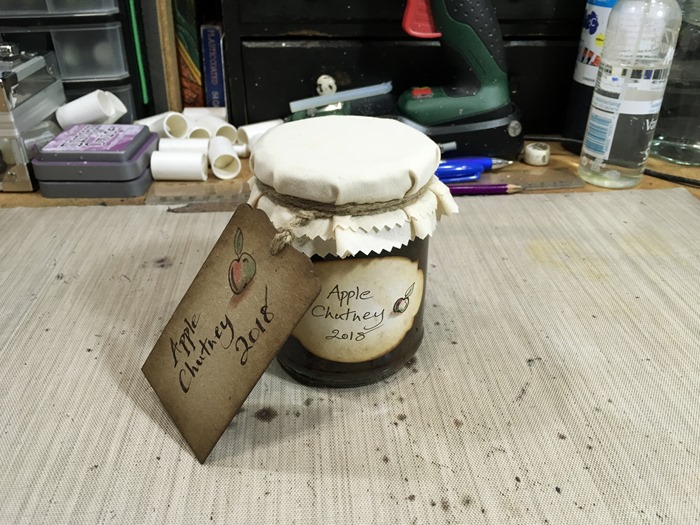
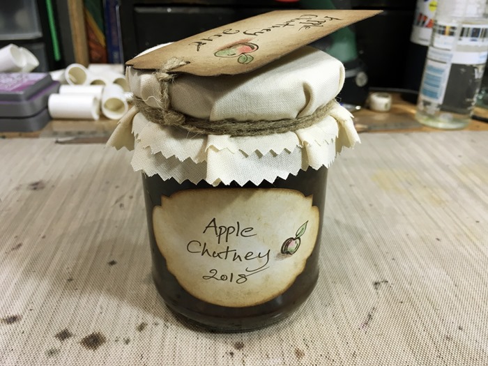
02 Apple Chutney with Labels

I drew a little apple on each label and coloured it with coloured pencils. I cut two circles of cream polycotton fabric from my stash for the lid, and tied on the larger label with jute string.

03 Apple Chutney Tie-On Label

04 Apple Chutney Stick-On Label

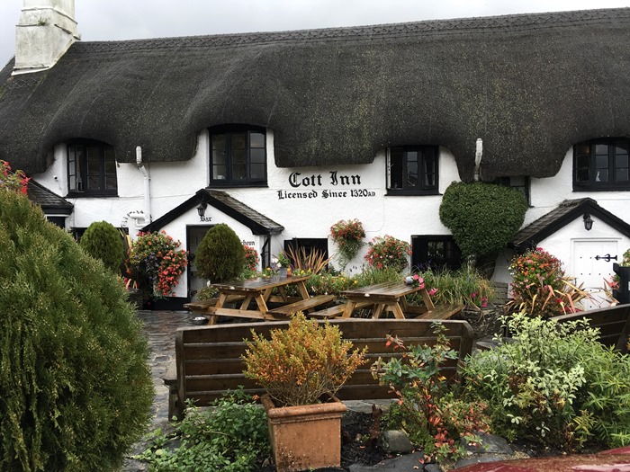
The outside of the lovely pub where we met for lunch.

01 Cott Inn, Dartington, Outside

Inside:

02 Cott Inn, Dartington, Inside

The food was quite delicious and beautifully served. My dish was described thus: “Free range Devon chicken breast, goats’ cheese, spinach and watercress mousse, prosciutto, crushed potato, spinach, red onion marmalade, bruised baby gem, chorizo cream sauce.” Wow!

03 My Stuffed Chicken Breast

This is my hubby’s beef and stilton pie. I love the way the mashed potato is served!

04 N's Beef and Stilton Pie

Our friend chose a fish dish.

05 Margaret's Fish

I love the way the chef has chosen different plates to suit the varied dishes, and in particular I like the way the lines cut in the crispy fish skin are echoed by the lines on the rim of the dish, the metallic glaze of the dish also reflecting the silvery effect of the fish skin. Very artistic!

Our desserts.

06 Desserts

The others had a scoop each of locally-made ice cream and I chose the lemon tarte which was accompanied by lemon sorbet in the shape of a lemon! Again, the perfect dish to set off this dessert.

I should have photographed my spiced carrot and sweet potato soup, too. The two pieces of ciabatta were cut diagonally and set on their ends in the most attractive way.

All very creative and extremely chefy! We will definitely be returning here.

It was raining when we arrived, but as we left, the sun was shining. What a lovely day we had.

Sunday, 18 October 2015

Card Factory 2015–Foiled Cards and another Florabunda Card

Today I made up three quick cards. The first two were made from my Florabunda Floral Mandala design which my friend Lucy foiled for me, one in gold and one in purple.

01 Two Foiled Cards

The gold one:

02 Gold Foiled Card

and the purple one.

03 Purple Foiled Card

Always hard to photograph shiny and reflective surfaces, but I hope you get the idea! I kept the matting and layering fairly simple. The gold one just has a 1/16-in matt layer made from gold mirror card, and then straight onto the white card base. I thought that was all that was required, to keep it clean and simple.

I didn’t have any purple mirror card so I used silver, again at 1/16-in, and then some of the pale purple glitter card from the collection I have used for other cards in this Card Factory.

Both simple designs, but with some impact, I think.

While I was having my final chemo on Friday, I did a bit more colouring with coloured pencils, this time in reds, oranges, yellows and a bit of purple, on my Flowers in a Circle Florabunda design, so I made up that card this morning as well.

05 Flowers in a Circle - Red, Yellow & Purple with Coloured Pencils

I made the 1/16-in matt layer from orange glitter card from the same pack, and then onto a wider matt of plain cream card. Again, quite simple, but co-ordinating with the design and colour scheme of the card.

Saturday, 10 October 2015

Card Factory 2015–Three Florabunda Cards


04 Three Florabunda Cards

I have started colouring some of the Florabunda drawings that Lucy printed out for me. For the top one I used coloured pencils, and for the other two, Inktense pencils.

07 Three Coloured Drawings

I kept the colour palette fairly limited in each case, and added a little background shading. For the third one, I ran a wet brush back and forth across the drawing after colouring it, which activated whatever Inktense had not been activated while I was colouring it – I quite like this streaky background. Using a coloured pencil for the background, as on the others, gives a bit more control, and this is probably what I shall do in the future.

Initially I was a little underwhelmed by the results but they did grow on me, and I had confidence that they would be improved once the drawings were mounted, with the matting and layering picking up the colours I had used on the drawings, and I was not wrong. I am actually quite pleased with the results now.

Before I began, I had a good look through my stash for some decorative paper and card to use – I am determined to make inroads into my huge stash, most of which I have had for years and have never got round to using – and ended up sorting out a lot of muddle, and my paper shelves do look a lot more organised now! This took longer than making up the cards, which were really quite quick. (So nice to feel sufficiently better to do enough to get a sense of achievement!!)

For the first and last cards, I found a pad of gorgeous decorative card that I’d forgotten I had – it is printed in different colours with flower and leaf designs, and each one has a little sparkle in it. I was very pleased that this did show up a bit on the photos – not much on the purple one, but certainly on the greenish one.

Each card was matted with some co-ordinated plain card before sticking down onto the wider patterned card, and then the whole thing was mounted on plain white card which formed the card base.

03 Flowers in a Circle with Coloured Pencils

For matting this second card, I found a piece of teal coloured card that had been the cover of a brochure. There’s quite a lot of useable card in this piece. The background layer was created with some paper with a slight texture and an embossed leather finish.

01 Leaves on a Curve with Inktense

The final card is matted onto dark red, which is the accent colour in the design. See the shimmer in the background layer.

02 Four Pods in a Row with Inktense

I spent a long time experimenting with different papers and cards, different layers, and different orders until I was happy with the results.

I am going to leave most of the cards blank inside for now, with no sentiments. It will be an easy matter to stamp a sentiment inside each card as I use it – much quicker than making a card from scratch!

I made plain white envelopes for them all with my Envelope Punch Board. These cards are safely in my new card stash which now has four cards in it! Not a great deal to write home about as yet, but I’m working on that! While sorting through my paper stash I found a few bits and pieces that can be used to make cards – the results of some faulty cutting with Sheba, my Cougar cutting machine, which can be salvaged and parts used – I am now very glad I didn’t throw these bits away!

Watch this space for more cards in the Card Factory.

Friday, 25 September 2015

Chemo and Rapunzel

Today I went in for my seventh, and penultimate chemo treatment. Yesterday I saw Dr. Lo, the oncologist, and as usual she was particularly concerned about the peripheral neuropathy – if one is not careful this side effect can become permanent, and the only way to reduce that risk is to reduce the dose of the chemo. I have already had two reductions of 10 percent each, and thought she might suggest this, but she said that as I was so near the end of the course, she could reduce it to half the original amount for the final two sessions! I was very surprised (and delighted) at this, and asked whether it might not compromise the effectiveness of the treatment. She replied that some research has been done on patients receiving chemo after the removal of their cancers by surgery, and it has been suggested that those whose dose is reduced, or whose treatment is shortened, do just as well as those who have the full dose for the full six months, so she was confident that I would be OK. I am looking forward to seeing if this affects how I feel over the coming fortnight – I should notice a huge difference!

The Ricky Grant Day Unit phoned this morning while I was still in bed, to ask if I would come in earlier than my 1.15 p.m. appointment. I was half expecting this, because it happened before when they’d made me rather a late appointment. Because the treatment takes four hours, they are anxious to finish before the unit closes for the day. Why they can’t think of this when they make the initial appointment is beyond me! Last time I had to rush around and was still late, but at least this time they asked me to come in at 12 noon, so I still had time to get up and do everything that was necessary, and have a bit of time to myself in the morning before setting off.

All went off OK, except that the place was absolutely heaving with people today! For the first couple of hours there wasn’t a recliner chair available for me, even though I specifically requested it because I find it uncomfortable to sit in a normal chair without having my feet up for any length of time. The chair they offered me was the same as the one I’d had on the ward after my operation and it was very uncomfortable! After a short while I transferred back to my wheelchair which was at least more comfortable and supported me in all the right places, but I really did want to get my feet up. It was rather annoying that the man sitting opposite me was sitting on a recliner but in its upright position, so he would have been just as comfortable on a normal chair, freeing up the recliner for the likes of yours truly!! Eventually, though, this recliner became available when the man left, and I sat next to a delightful couple (husband having treatment) and we had a nice chat.

As usual, I took a bag of things in to do, but ended up not touching most of it, because I had printed out some free downloads of adult colouring pages, and decided to work on one of these. The nurses were very interested and loved what I had done, and enjoyed seeing it progressing. They are all so friendly and lovely.

This is the finished drawing. After using my Sharpies for the Koi Carp drawing I did before, this time I decided to go for a more subtle effect using my coloured pencils, which blend beautifully for shading.

09 Completed Drawing

Here is the original printed drawing.

01 Printed Drawing

My c9lored pencils, which fit very nicely in one of Dad’s old cigar boxes! Beside it are the other bits and pieces I thought I might need – pencil sharpener, paper stump for blending, pencil-shaped eraser, Zig Millennium archival pen, soluble graphite pencil, water brush. In the end I didn’t use the pencil sharpener, the graphite pencil or the water brush,  but everything else came in handy.

02 Coloured Pencils

Now for some detail shots. Here is a detail of the hair. I had fun shading this!

03 Detai - Hair

Detail of the prince. Note the shading on his hat.

04 Detail - Prince

Detail of the trees and towers. I like the roofs on part of the castle, that I decided to colour to look like terracotta tiles.

05 Detail - Trees and Towers

Detail of the top border. The lattice didn’t look like a wooden one to me, with its cross-shaped pieces connecting the bars – it looked more like metal, so I coloured it as such. This suggested to me the fact that Rapunzel was imprisoned in her tower. The top border has a slightly art nouveau flavour to it.

06 Detail - Top Border

Detail of Rapunzel’s face. You can’t see it very well in the photo but she has a delicate blush of pink on her cheeks, and blue eyeshadow. Note the shading under her arm.

07 Detail - Rapunzel

Lastly, a detail shot of the bottom of the picture. I love how the hair spills out beyond the frame of the picture. The whole picture has a lovely fluid feel to it.

08 Detail - Bottom Border

A final glimpse of the finished picture again. You will notice that I added a drop shadow which gives the picture a bit of dimension. I hope you enjoyed it!

09 Completed Drawing

Edit: You might be interested to visit http://www.coloring-pages-adults.com/ where I downloaded this drawing – they have got literally hundreds of amazing adult colouring pages for free download, arranged in categories. More than enough for a lifetime of happy colouring, I should think! Have fun.

Tuesday, 22 September 2015

Quadruple-Embossed Birthday Card

The second of two posts today.

After making my triple-embossed purple get-well card the other day, I thought I’d take this one one stage further and make it quadruple-embossed! This is a sort of embossing sampler: embossing with an embossing folder; embossing with a die; heat embossing, and finally, hand-embossing! I’m pretty much embossed out after that lot.

It is my aunt’s birthday on 28th September and I needed to get on with this before my next chemo session on Friday because after that I won’t feel like doing anything for a week to ten days.

16 Finished Card

I began in exactly the same way as with the previous triple-embossed card, with the same sized card base and matting and layering, and the same Cuttlebug embossing folder because this is the only one (except for a gearwheels one that wasn’t appropriate) that is wide enough for this size of card.

01 Triple Embossed Card

I inked the blank area with Spun Sugar distress ink, and heat-embossed the Cuttlebug-embossed part with clear embossing powder (this time I applied the Versamark with my brayer which worked better, and it was certainly improved by my remembering to use my anti-static bag this time!). I inked it using more Spun Sugar, using an Inkylicious Ink Duster, so that the clear embossing acted as a resist.

Then I began work on the embellishments. I had intended to stamp some flowers and cut them out, but my few flower stamps are all rather solid and don’t give much scope for colouring in, so I decided to draw some flowers. I outlined them in pencil first and then used a Ranger Brush Tip in its holder with my new Hickory Smoke distress ink. I love this new colour – a lovely soft grey which tones very well with the Wendy Vecchi archival ink pad called Watering Can.

02 Drawing the Flowers

After I had drawn them all with the Hickory Smoke, I coloured them in using two shades of pink coloured pencils, blending the colour with a paper stump.

03 Colouring the Flowers

After cutting out the flowers, I hand-embossed them with two sizes of ball-ended embossing tools onto a piece of fun foam.

04 Hand Embossing the Flowers

Here are the flowers, all embossed and ready to go.

05 The Flowers Embossed

I could not stick them down until the end because the glue would still be wet. I moved on to stamping the sentiment on the front of the card, using said Wendy Vecchi archival ink in Watering Can. I used stamps from the Stampin’ Up set “Memorable Moments.” This is a lovely set because it can be used for anniversaries too, and comes with a set of numbers. I used my stamp lining up tool to get it in the right place.

06 Stamping the Sentiment

Now time to start matting and layering. The first matt layer was done with Hickory Smoke distress ink and was 1/16 in larger than the card topper.

07 Inking the First Matt Layer

I found an excellent tip a while back for lining up the matt layers accurately – with such a small difference in size, the slightest inaccuracy would show. I ran my ATG glue gun over the back of the card topper and then went over the DS tape with a glue stick, which makes it slick and moveable for a short period, giving you the chance to get it just right.

08 The First Matt Layer

The second matt layer, again 1/16 in larger than the previous one, was done with Forest Moss distress ink.

09 Inking the Second Matt Layer

10 The Second Matt Layer

To complete the card assembly, I inked the edges of the card base with Spun Sugar distress ink and matted and layered the rest on top.

11 The Card Base Inked and Assembled

I then stamped the sentiment on the inside of the card, using the same Stampin’ Up stamps from the “Memorable Moments” set. I inked around the edges with Spun Sugar distress ink.

12 Samping the Sentiment Inside

Now for the embellishments on the front of the card. I found some small leaf trails from my stash, that I’d cut with Sheba, my Cougar cutting machine, ages ago. I stuck them down with Crafter’s Companion Stick & Stay spray adhesive.

13 Sticking Down the Leaf Trails

I stuck the flowers down with Pinflair gel glue. I always use a cocktail stick for this – I find it a lot easier to control than a syringe, and I find that if you put this glue in a syringe, it is not long before it dries out and sets, wasting glue and ruining a good syringe!

14 Sticking Down the Flowers

The final step was to add some holly Stickles (glitter glue) to the centre of each flower.

15 Adding the Stickles to the Flower Centres

The completed card. Nice and pretty for an elderly lady, I think!

16 Finished Card

Left out on the desk overnight to give the Pinflair glue and the Stickles time to set.

Monday, 6 July 2015

Practising Doll Faces and Completing Doll Body

Doing a bit more work on my angels project. Today I practised drawing doll faces according to the instructions of Patti Medaris Culea (links provided by Judy). Not as difficult as I thought, and working from right to left, I think I am gradually improving!

04 Practising Dolls' Faces

I used some coloured crayons and some pens. I worked on a strip of unbleached calico ironed onto a piece of freezer paper to give it a bit more stability.

I also completed the body of the large cloth angel.

03 Large Cloth Doll Body Complete

I had awful trouble stuffing this – the polyester stuffing which I have had for many years is really not very good quality and it came out all lumpy, so I had to pull most of the stuffing out of the body and tease it out again and restart the process. This filling seems to do better with narrower pieces like arms and legs than it does with larger volumes, which work better if I don’t attempt to put too much stuffing in. I’m on the look out for something of better quality but so far my online researches haven’t come up with anything definite – if there’s anybody out there (UK) who can recommend a decent polyester filling I’d be grateful.

I also spent a bit of time in my ARTHaven this morning, tidying up, and putting all my Dylusions sprays, paints and Ranger mini-blending tools together into one box, after painting a dab of paint on the top of each handle so they are readily identifiable.

The effects of my third chemo treatment are definitely not as severe as those of the second. The reduced dose has definitely helped.

Monday, 10 January 2011

Beehive Explosion Box – Parcelled Up and Ready to Go

I’m feeling a bit sad today, because I have looked at my Beehive Explosion Box for the last time. It is now all parcelled up ready to be taken to my friend’s sister’s on Wednesday afternoon; she will take it up to London when she visits my friend in the spring.

As always when I have made something, especially something in which I have invested a great deal of time, and of myself, when it goes to its ultimate destination I feel a sense of loss, as if part of me has gone with it. I am very glad, though, that through modern technology – digital photography, video, computers, the Internet, blogging – not only can I look at the pictures any time I want, but they are there, available for sharing with anyone who wants to enjoy them. Although I say so myself, and not wishing to boast, I think this is the best piece I’ve made to date, and it was so much fun to make! Everyone who has seen it has enjoyed it too – all the detail, and the fun I have had interpreting the complex life that goes on inside the beehive… I have also learnt some new techniques through this project, and gained in confidence in my work. I know that with a bit of imagination, time to mull ideas over, and opportunities to sleep on it, I can make whatever I want to make now! – and that’s really thrilling.
Today I finished the final touch. It struck me that if my friend simply opened it like a normal present, she wouldn’t know it was an explosion box and needed to be opened correctly for the explosion to take place, so I have made a little instruction book to go with it. I did this on the computer (using Serif PagePlus, my desk-top publisher) and have saved it for any other explosion boxes I might make in the future.

I printed the text and lines on the computer, and hand-coloured it using coloured pencils. The cover is made of card, with a paper insert for the instructions, and it is bound with some fun yarns.

Here is the front:

1 Instructions Front

and this is the back:

2 Instructions Back - Blurred Text

This is a view of the whole of the inside:

3 Instructions Inside

and details of the two pages:

4 Instructions Inside L

5 Instructions Inside R

Finally, here is the parcel containing the box. Before wrapping it loosely in tissue paper and tying it with more of the decorative yarn, I tied a piece of brown ric-rac braid around the box, securing the lid so that it doesn’t fall off when she unwraps it.

6 Parcel

The whole thing has gone into a small Christmas decorated carrier bag, packed around with more tissue paper, and I’ve included a small 3 in x 3 in card (originally intended for the Stationery Box project I made before Christmas, but rejected because the embellishments were too thick) with directions to my blog, so that she can see her box from start to finish, with all the photos and the video. I wish her a very happy belated Christmas and hope she enjoys her box as much as I enjoyed making it.

Related Posts Plugin for WordPress, Blogger...