Showing posts with label Masks. Show all posts

Sunday, 8 April 2018

Floral Mini-Album Pt 5 Working on Pages 4 and 5

Recently I made a new mini-album, about my mum who died in December. I was unable to publish anything about this until now because it is a present for her best friend, who sometimes visits my blog, and I wanted it to be a surprise for her. I wrote a series of blog posts as I did each stage of the project, so I didn’t forget what I did, and they will be published in sequence now the project is finished and has been given to our friend.

If you want to see the finished project, please click here.

Starting work on another double-page spread today. This one is to have a musical theme.

I began with the second page, page 5. I placed the Tim Holtz music mask over the page and gently applied three colours of Distress Oxides with an ink blender. I used Broken China, Worn Lipstick and Peeled Paint. This is the first time I have tried the Distress Oxides on black paper and they really do work well.

The next photo shows the Distress Oxides having been spritzed with water, with the mask still in place.

The mask removed. I am pleased with how sharp the outline is.

There were some problems with this, though. Firstly, it was much too strong and dark, and secondly, this mask really annoys me because it isn’t proper music. I do wish when people design stuff like this, that they would consult someone who knows, if they themselves don’t know – the designer of this clearly doesn’t know anything about music! It’s the only mask I’ve got (maybe this is a hint-to-self: get on with it and make one yourself!!) so I made do with it, and thought that if I made the effect more subtle, the fact that it’s wrong would be less noticeable. There will probably be some sort of mat or flap over the top anyway, which will partially conceal it.

Here it is with a second layer of Distress Oxides having been applied, spritzed and dried. Already it looks better.

The final touch was to add some infusions to produce a bit of texture. These work very well with Distress Oxides – it’s the first time I’ve tried this combo. I used Royal Blood and The Sage from set 1, and Magenta from set 2.

I may put some sort of border around this. I had thought of using some Tim Holtz tissue tape that I had in my stash and hadn’t even opened. I attempted to use it, but this stuff is a total pain – it is very thin, and ultra sticky, and when I eventually found the end and tried to unroll the tape, it constantly ripped along its length, and was impossible to use. It has gone in the bin. Do not waste your money on this stuff!!! I was amazed because most of his stuff is such good quality. I googled the problem and found that I was not the only one who has experienced this difficulty with it. In the end I left the page as it was.

I then moved back to page 4 and made the pocket mat. I cut this from plain white cardstock and stamped it with a music background stamp. I laid the card strip onto the stamp platform an inch in from the edge, so that I wouldn’t get the edge of the music on the card, but a borderless effect.

It took some experimentation, and proved quite difficult to do because the card was longer than the stamp, and it meant doing several trial runs on scrap paper after I’d stamped the top half, in order to line it up and get the spacing correct, and when I moved the stamp down further on the stamp platform, it projected over the edge, so I had to press it down hard and hope for the best – that it would produce a decent impression, and also that it wouldn’t fall off mid-way through! All was well in the end. I stamped the pieces using black archival ink, and the stamp I used was “Music Background” from the Artistic Stamper.

Again, this looked much too stark, so I inked it with a combination of Distress Inks, using Inkylicious Ink Dusters, in Broken China and Victorian Velvet, and afterwards distressed the edges with Forest Moss, using a DIY ink blending tool.

For the mat for the remainder of page 4, I used some of the paper from the stack, and again distressed the edges with Forest Moss distress ink.

Here is page 4 with both mats stuck down.

This is the double-page spread of pages 4 and 5, laid onto the cover with pages 1 -3. I have not yet decided what to put on the flap of page 5, but underneath there will be a piano keyboard pop-up.

Once the basic structure of the pages is complete, I can think about the inserts, photo mats, envelopes, pull-outs, etc. etc.

Monday, 16 October 2017

Card Factory 2017

My stash of cards had pretty well run out so I really had to get down to making some more. I’ve decided I don’t really enjoy card making that much, so it’s a bit of a chore but I haven’t quite got to the stage when I’ve given up altogether and resorted to buying them!

Rather than falling into my usual trap of turning each card into a major work of art and taking far too long over it, I kept these ones simple. I shall continue to make special cards when the occasion demands, but the limited time I have available to spend in the studio (dictated by busyness elsewhere, and being too fatigued to do anything) is now dedicated to art projects I actually want to do, such as mixed media, books, experimenting with materials, etc.

Today I made seven cards. Six were more or less identical and were on a production line basis, and the other was a one-off which I made for our neighbour whose birthday is today.

I really struggled with these! Such a simple project, but if anything could go wrong, it did… I was feeling a bit brainfogged which really doesn’t help, and I made quite a few mistakes which were not able to be remedied unless I started again, so I pressed on. As a result, they are not my best effort!

I began by making a circular mask. Rather than setting the cutting machine up (couldn’t be bothered – too tired!!), I cut a 2-inch circle with a punch, which of course had to cut quite near the edge of the paper, so I stuck this with a glue stick to a larger piece, out of which I had cut a rough circle, larger than the punched circle. This is the back of it.

Turning it over, it provided enough margin not to allow anything to stray beyond the edges.

I had a couple of abortive attempts. I sprinkled Infusions (The Sage from set 1) through the mask onto two of the sheets I’d cut for the card toppers. In order to get enough coverage, they came out much too dark to stamp on. The one on the right was slightly lighter, and I thought I’d run over it lightly with a wet brush to make the texture smoother, but this was a disaster. Bin time.

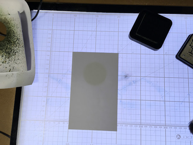
It was hard to know what order to post the photos in, because in order to photograph the process I went through, I had to get ahead of myself a bit – I used the first successful circle as a guide for the rest. Here it is on my light panel, ready to use as a guide.

I lined up the next sheet over it, and you can just see the circle showing through.

I was then able to lay the mask on top. I had to do it this way because the mask was bigger than the small sheet and I had no way of lining it up otherwise.

I’d decided the only way I could get the effect I wanted, with good coverage of colour but with a little of the Infusions texture, was to ink the circle first with distress ink using an Ink Duster (I used Bundled Sage), and then add the absolute minimum of Infusions on top. This worked well.

Here is the distress ink going on, through the mask.

I picked up the whole thing and without disturbing it, carried it back to my main work area and sprinkled on the Infusions through the mask.

I spritzed it lightly with water without moving the mask.

I left it to stand for a minute or two and then blotted it off.

Finally, I removed the mask and dried it with my heat gun.

Here are the finished circles.

The problem was, I should have cut these pieces from card, and not from paper. The paper didn’t stand up too well to getting wet, and it buckled a bit.

I got out a selection of stamps, to choose which designs I wanted to use.

Using my wonderful new stamp platform, I stamped a single image onto each circle, using black archival ink.

This flower head one didn’t have a stem – you could use one of the stem stamps from the set but it meant setting it up on the stamp platform, and I thought it would be simpler just to draw one in with a black marker pen afterwards.

I have always been hopeless at stamping. The stamp platform is a marvellous tool for someone like me, but would you believe it… Only Shoshi could mess up a stamped image using a stamp platform!!! On the one in the next photo, the impression wasn’t quite good enough so I did it again, not realising that because I’d used paper instead of card, on the first impression the stamp stuck slightly and the paper moved fractionally when I lifted the lid of the platform. When I did the second impression, I got a doubled, blurred image! Grrrrrr. The tree branches weren’t too bad and I could get away with that, but the base part looked a mess. I blended it out with my alcohol pen and managed to salvage it!

Here are the other completed stamped images.

Finally, I matted and layered the toppers onto A4 white card folded to A5. Again, I experienced problems because the paper I’d used for the toppers was too thin, and I got a bit of buckling and creasing when I layered them, so the finish isn’t that great…

The final step was to stamp the sentiment on the bottom. I used my green archival ink for that, and again used the stamp platform.

One single finished card, which shows what this stamped image should look like when you don’t go and blur it!

I actually made our neighbour’s card before I did the set, and I should have inked first with distress ink and then added less Infusions, which would have given a better result, but you live and learn!

I began by taking a mask from my stash. Some time ago I made a card with lots of butterflies and frames on it, and had a frame-shaped piece of card with six butterflies cut out of it on the cutting machine. I laid this down on top of the card base and sprinkled Infusions over it (Violet Storms from set 1).

This is the finished card. I didn’t really like it much as the outlines were a bit blurred. I went around the outside of the frame and butterflies with my white marker pen, and then defined the wings of the butterflies with a silver glitter pen and the addition of some stickles.

The final step was to add a silver peel off for the sentiment, and this doesn’t show up very well! Not a great effort.

Why do I find cards so unsatisfying to make?? Perhaps if I enjoyed doing them more, I’d do them better!


PS Today is the second anniversary of the day I finished my chemo! Where on earth has the time gone?

Thursday, 22 June 2017

Infusions Mini-Album–Cutting the Tags

Several of the pages of my mini-album are made from flattened toilet roll cores, made to take tags on which there will be written instructions and explanations of the various samples of uses of Infusions.

I counted the number of tags I needed from the typed charts I made, and it came to 30. Using some scrap white card, I have cut out these 30 tags, each measuring 2 1/2 x 4 inches. They slide nicely into the flattened toilet roll centres with enough protruding to pull them out, and to allow for some yarn to be threaded through.

Thinking that pulling them out by the yarn would eventually tear the hole, I made a set of reinforcements for the holes, one to be stuck on each side of the tag.

To make these, I punched a small hole in some scrap card, using my Fiskars small single hole punch, and then lined up my 1/2 inch circle punch as best I could so that the small hole was in the centre, and punched it out. Some of them were a little offset but I’m not too worried about that.

The scraps of card left over from the punching are quite interesting so I think I’ll keep them and use them as masks/collage pieces perhaps.

The tags with their reinforcements.

Order of work:

  1. Mark centre of short edge of tag.
  2. Stick reinforcement over mark.
  3. Line up small single hole punch over the central hole in reinforcement and punch small hole through tag.
  4. Turn tag over and stick second reinforcement over small hole in tag, lining up holes.

Seems to work OK so far!

Next step: to colour the tags ready for adding text. As the Infusions give a very mottled, textured-looking surface, I thought it would be better to colour the tags with Distress Inks and Distress Stains, and add tiny amounts of Infusions afterwards if they needed a bit more interest, probably concentrating on the edges of the tags that will be visible when they are in situ. After all, the focus on the tags must be the text, not the background, which should remain less conspicuous. I can co-ordinate them with their respective pages.

Monday, 12 June 2017

Infusions Mini-Album–Beginning the Title Pages

I resumed work on the Infusions mini-album today, and made the title pages for the various sections of Book 1.

I used the backs of some reject pieces from when I was making the sample sheets, and also cut new pieces of card to size for these. I began by making a title for the colours, made of Infusions from both sets, before remembering that I was going to make a separate title for Set 1 and Set 2, so I put this aside to use elsewhere. I had some fun with this, as I wanted to created  rainbow striped effect, so used pieces of scrap paper to mask off areas where I didn’t want the Infusions to go.

I made two more pieces using colours from Set 1 and Set 2 respectively, and after drying them, distressed the edges with Black Soot Distress Ink – I followed this pattern for the remaining title pages, too.

Adding the text to the colours title pages, using a white Uniball Signo marker pen, and a black archival pen to fill the letters.

Here are the remaining title pages for Book 1.


The next one was done with a small flat brush and white acrylic paint, and outlined with black pen.

I also wrote the names of the colours on all the colours sample pages. I didn’t photograph these as they will be done when I photograph the finished project.

The next task will be to repeat the process for Books 2 and 3, and then I can start working on the tags.

Today I had an idea to deal with the problem of Book 2 being thinner than 1 and 3. It will be bound between the other two, and the addition of some 3-D paper flowers on its front cover will make quite a nice focal point, I think, and they won’t be squashed by the large cover which will bind the three mini-books.


Friday, 5 December 2014

Recycled Mini-Album Pages–Clocks

This post is about the penultimate page of the mini-album, and deals with one of my dad’s most absorbing interests.

He was a keen and expert horologist. He collected many clocks during his life, and was a skilled clock repairer. Over the years he amassed a comprehensive set of tools for this purpose, including a watchmaker’s lathe to complement his larger engineering lathe. He was always sketching on scraps of paper – ideas for repairs, clock movements, etc. This album would not be complete without some pages on his passion for clocks.
I recently acquired a gearwheels stencil, an “ArtMask” from Carabelle Studio, called “Rouages Steampunk.” Strictly speaking, it is a mask rather than a stencil, because it is the background that is cut away. I tried to make a gearwheels stencil once, with the gearwheels, rather than the background, cut out, and it all fell apart and I ended up with a fine collection of acetate gearwheels! (I am using them as masks, and for sticking onto projects, so they are not wasted.) Anyway, in this case, I wanted the actual gearwheels to be gold, and the background to remain black, so I did a bit of reverse stencilling. To do this, I first painted the whole page with metallic gold acrylic paint, and while it was still wet, I laid the mask on top and secured it top and bottom with some masking tape. I then wiped away the gold paint through the holes in the mask. To start with I used a baby wipe, but this was too wet and it spoilt the design underneath, so I had to wipe off all the gold paint and start again. A piece of kitchen paper wasn’t sufficient for paint removal, so I took a fresh baby wipe and wrapped it in kitchen paper and used that, which was better. For the second page, I dried a fresh baby wipe slightly with my heat gun, and the results were fine.

131 Clocks Page Background

I am pleased with the metallic finish on this background.

The next step was to lay down some images as the next layer of background – a scanned image of a diagram of a clock escapement, and some photos of various clocks my dad repaired. I decided to fussy-cut the background away and lay them down so that the background would show through.

132 Fussy Cutting the Images for 1st Clocks Page

Here is the first clock page complete, with the addition of photos and embellishments, and the trademark white border. The images in this case were laid down with soft gloss gel medium, so as not to interfere with the reflective surface of the gold background. The clock face was a cut-out, which I had distressed and kept for another project – it had been in my stash for some time.

133 1st Clock Page Complete

The first photo I chose was of some clock parts my dad made from scratch, to replace some worn ones in a clock he was repairing. He would always try to reproduce as faithfully as possible any clock parts he replaced, to be in keeping with the period – for instance, adding metric threads, or modern gears in an antique clock would be an anachronism, which would have offended him, not to mention reducing the value of the clock. Next to this photo is a picture of my dad’s little repair notebook, packed with his tiny, almost illegible writing! (He was a doctor, after all…) In this book he kept a record of all the repairs he carried out on people’s clocks, and could refer back to this, the next time a clock became an inpatient in the clock hospital. At the bottom is a photo of a church clock movement he repaired.

134 Clocks Title Detail

In the above detail shot of the title, you can see one of the Friendly Plastic gearwheels I made several years ago, with added gilding wax and Glossy Accents (neither of which shows up very well on this photo). This was stuck down with Pinflair glue.

The next photo shows the second clock page with the photos added. A bit more of the gold gearwheels background is left exposed in this one, but there is a fussy-cut clock movement laid over the left-hand page. On the right hand page you can see a photo of one of Dad’s antique clocks – his oldest one, a 17th century Cromwellian clock that my grandfather picked up cheap in a sale “because it’s only got one hand,” when they were made with only one hand!

135 2nd Clock Page with Photos

With the addition of borders and some text, the page is complete. You can see the tag puller on the right – more details about the tag below.

136 2nd Clock Page Complete

A couple of detail shots of this page. First, the top of the page, showing the gearwheels border I created, and the blue-painted clock movement (another church clock that he repaired) overlaid.

137 2nd Clock Page Top Detail

At the bottom of the page are photos of two models of different types of clock escapement that Dad made from perspex. He used these on an overhead projector to illustrate the difference, during his lecture “The Clock Doc – or Horology in a Nutshell,” his presidential address at his local medical society. Typical of Dad, he spent many hours making these models, and they were up on the screen for only a few minutes. They are now in my possession.

138 2nd Clock Page Bottom Detail

Preparing to make the tag. You can see the semi-circular shape I have punched out, and the printed clock face image ready to be punched out with the same punch.

139 Making Clock Puller for Final Tag

The clock face tag puller attached to the tag.

140 Clock Puller for Final Tag Complete

The tag in situ, showing how the tag puller fits exactly into the semi-circular hole.

141 Tag with Clock Puller in Situ

Because the two pages glued together to form the tag holder came at the end of the clock section, the reverse of the tag is different. Here you can see the stamp I used – one from the Stamp Attack Butterfly Doodle Dallions set.

142 Materials for Flower Puller for Final Tag

I used some Cosmic Shimmer Lapis Cobalt Aurora fine embossing powder to stamp the image, and then three different Perfect Pearls (Plum, Kiwi and Turquoise) applied like watercolours to colour the image. After this I punched out the shape.

143 Making Flower Puller for Final Tag

To complete the tag puller, I distressed the edges with Black Soot distress ink.

144 Flower Puller for Final Tag

Here is the reverse of the tag, with the flower tag puller attached.

145 Flower Puller on Final Tag

This picture shows the tag in place, with the flower tag puller nesting into the semi-circular hole.

146 Tag with Flower Puller in Situ

The background and border on the clock side of the tag. I used an Artistic Stamper stamp for the background (“Cogs”), stamping with Versamark, and adding some Cappuccino Perfect Pearls with a soft brush.

147 Background and Border for Clock Tag

Here is the completed clock side of the tag, with some journaling with my white marker pen.

148 Clock Tag Complete

Here is the reverse side of the tag, completed. As this lines up with the final page of the book, I decided to make this one a summary of all my dad’s qualities and accomplishments as celebrated throughout the book.

149 Final Tag Complete

All that remains to be done on the book now is the final double-page spread, and then a couple of pages of information about how the book was constructed and embellished. If there is room, I shall add a couple of blank pages at the back for notes and further photos.

Related Posts Plugin for WordPress, Blogger...