Showing posts with label Serif PagePlus. Show all posts

Wednesday, 7 November 2018

WOYWW 492 Peacock Feathers and Purple Spots

This week I’ve been working on crochet and knitting projects.

Crochet Peacock Feathers

Working on the peacock feather embellishments for my peacock scarf.

02 Adding the Barbs to the Feathers

When I did the ironing the other day, I pressed the ones I’d completed and this really improved their appearance. After this I made a few more, but have now run out of the lime green so will need to order some more.

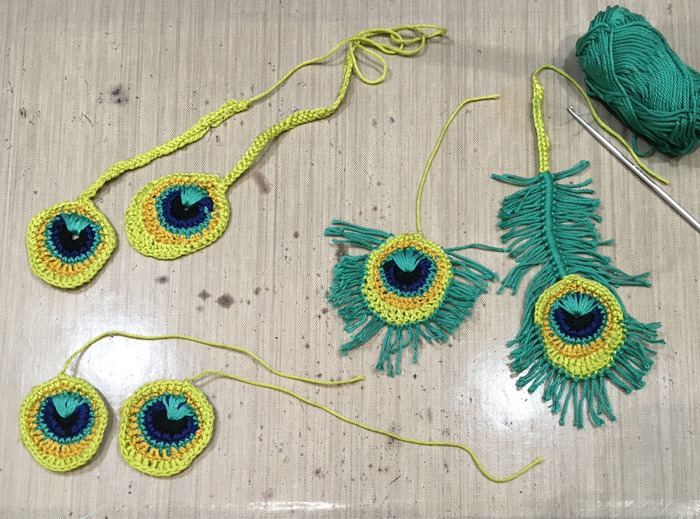
Yesterday I began adding the “barbs” to the feathers. On the above photo you can see the two variations I’ve made of the pattern: one feather with a shaft and one without, with their barbs added – I still have a few more to add to the shaft of the one on the right.

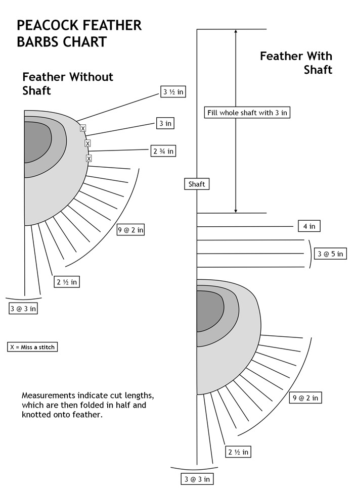
I spent quite a bit of time experimenting with different lengths, and making a chart on my desktop publisher so that I know how many of each length to cut. On the original instructions it said just to add them (no measurements) and then trim them but I thought that was rather wasteful of yarn when I had so many to do (amazing how the inches soon add up!) so I thought a bit of advance planning would pay off better.

Peacock Feather Barbs Chart

They will need a small amount of trimming but nothing significant. I may not have enough of the peacock coloured yarn to complete this so I shall hold out on ordering more of the lime green until I’m sure.

The next step was to comb out the barbs. The instructions said to use a wool carder for this, but when I tried, it tended to pull the strands off so I abandoned that, and tried with a stiff brush, but that didn’t really work.

03 Feathering the Barbs

In the end I used a fine embossing tool to tease out the plies of the strands. They look a bit kinked but once they are steam pressed they should straighten out.

These feathers are proving to be a lot more labour intensive than I’d thought! Attaching the barbs is extremely fiddly, but I don’t really mind because there’s no time limit on this project.

Re-knitting the Purple and Yellow Circles Jumper

04 Back - Knitting in Progress

During the week I made good progress on re-knitting the purple and yellow project I spent so long unravelling. It’s looking good! I had a lot of problems initially because I was keen to centre the pattern repeat. If I don’t do this, when I get to the neck, it will stick out like a sore thumb if it’s wrong! The trouble was, I kept ending up with the wrong number of stitches between the circles, and spent hours and hours undoing it and redoing it until I’d sorted out where I was going wrong. My hubby thought I was spending far too much time and effort on it but I told him if I didn’t get it right at the beginning, the whole thing would be a struggle. Eventually I got it right, and I can now knit away happily, almost with my eyes shut! Well worth the effort, and a good sense of satisfaction for having invested the time in it.

Kitties

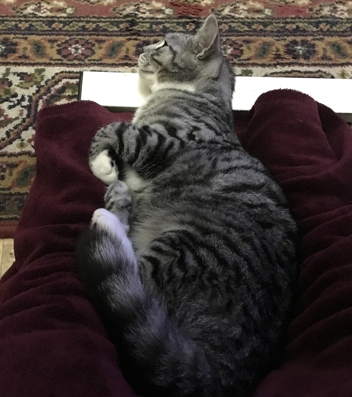
Lily relaxing on my feet. I’d just put the recliner down because I wanted to get up, but she showed no sign of shifting herself and is resting her head against the foot of my table!

01 Lily on My Legs 1-11-18

She is sooo soft and fluffy!

Ruby relaxing on top of Lily.

12 Ruby Sleeping on Top of Lily in Hammock 31-10-18

Her favourite place. Her sister is like a little soft feather mattress. Good thing she doesn’t seem to mind!

After being dirty little stop-outs all through the hot summer, they are now very content to be happy little indoor lap-cats and don’t much appreciate the cold and the rain!

More on the Pet Service

At church on Sunday, our resident photographer had made a montage of all the photos and put them up on the noticeboard.

01 General View

03 Pet Service Montage

Note Lily and Ruby bottom left.

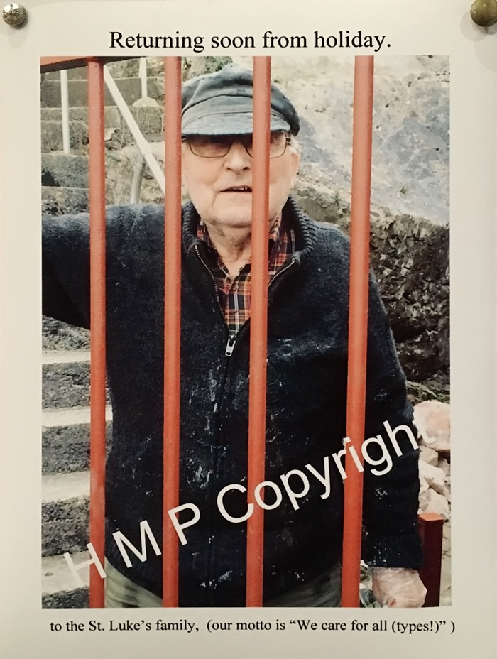
I just had to get a picture of the photo of one of our members coming down the steps outside while doing some work with the Men’s Working Party!! Good thing he’s got a sense of humour!

02 Fun Pic of Len

(For non-UK residents, “HMP” is “Her Majesty’s Prisons.”)

Sourdough

Another turtle again this week, I’m afraid.

52 Another Turtle 4-11-18

I haven’t had time to research further this week, but I’ve got a few Youtube videos saved which I’m going to refer back to, and have another go with a different method and see if I can be more successful. The only thing I can think of that has changed is the weather. When I started with this method I was able to produce a very acceptable loaf – this one was baked back in August.

30 First Really Good Sourdough Loaf Cut 12-8-18

It’s all very mysterious because when I turn the bread out into the Dutch oven after its final proving, it always collapses and spreads, and I’m not getting the required oven spring to give it the height during the first 20 minutes of baking, which I was certainly achieving when I first started using the Dutch oven method. People say that this is all down to the handling, and not over-proving the dough, which causes it to collapse. I don’t think I’m folding it any differently from before, and if the colder weather is having any effect, it would surely be to under-prove the dough, not over-prove it.

This time I did try using a bit more of Esmeralda (my starter) but all that did was to make the dough more hydrated and a bit more difficult to handle. It still collapsed.

It’s disappointing when I have achieved better results in the past, and now seem to have slipped back. I’ve left a couple of comments on the blog of the baker whose technique I have been following, but he hasn’t replied.

I did make another batch of very successful sourdough starters from excess Esmeralda, and I’m pleased with those. Really thin and crispy! This recipe is a huge success and now one of our staples. Very nutritious and tasty.

Health Update

My first pair of support pants arrived, replacing their first attempt which didn’t fit, and they are fine. I contacted the firm immediately and requested the other two pairs to be made as soon as possible to the same pattern, and I’ve heard from them that another prescription has been requested – I had thought they’d ordered all three on the one prescription but apparently not, which is going to cause more delay. She said they would put it through urgently, but at least I’ve got one pair to wear, but I shall have to wear an old pair when they go in the wash.

After receiving a letter from my surgeon confirming the definite return of the hernia, I have now had an appointment to see him in mid-December, which is better than I’d hoped – I really didn’t expect anything before the new year. I hope he will agree to leave it alone and hope for the best, that it doesn’t cause another obstruction. At least Kermit, my stoma, is working very satisfactorily, not like last year when the hernia was causing him so many problems.

I also have my regular six-monthly oncology appointment tomorrow. I am not anxious about this, and am sure that all will continue to be well on that front. After this, I shall probably only see her once a year for the next two years, and if all continues to be clear, they should discharge me after that.

Other Activities

Last week we went to Somerset and met up with some friends who live near Bristol. We try to meet up for a meal several times a year, choosing a place that’s about mid-way between us. They are very old friends – my hubby knew them years before I met him, and we’ve been married 32 years, so they are very much part of our lives! We had our usual brilliant time, with a great meal too. She has completed all her embroidery City and Guilds and is now working on her diploma (what she laughingly calls her “diplomol” as they would say in Bristol! – on old maps, Bristol is called “Bristow” but they have to put an “L” on the end of everything haha!). She is very good indeed at what she does. I took along the album I made about Mum, in its new box, so that she could see what I’d been up to lately. As it was quite a long drive, I was able to work on my knitting, and sorted out the problem on the way up.

I’ve got to try and do some cooking tomorrow or on Thursday – I’ve got chicken and lots of roasting veggies arriving in my grocery order tomorrow, so I can get on and produce some freezer fodder.

Sunday, 15 July 2018

A Remarkable Find

It seems to be the season for rediscovering long lost things for me at the moment. As I described in a previous post, I recently had returned to me a little book which I thought I had lost for good. Then, this evening, another discovery from the past came my way, of a different nature.

My hubby and I were watching “The Antiques Roadshow” on BBC TV this evening, and someone brought along a rather intriguing picture from the Arts and Crafts Movement, of a seascape in enamel, surrounded by a repousse frame made of silver, depicting various forms of marine life, and a circular-shaped piece of mother-of-pearl inlaid at the bottom. Embossed in the silver were the first two lines of a poem, “The sea hath its pearls/The heaven hath its stars,” which rather intrigued me for some reason, so on the spot I decided to google this and see if I could find the entire poem.

The first site I visited was “Writing and Ruminating: One Children’s Writer’s Journey.” I discovered that the poem was Das Meer hat seine Perlen by the German romantic poet Heinrich Heine, translated into English by Henry Wadsworth Longfellow as follows:

The sea hath its pearls,

The heaven hath its stars;

But my heart, my heart,

My heart hath its love.

Great are the sea, and the heaven;

Yet greater is my heart,

And fairer than pearls or stars

Flashes and beams my love.

Thou little, youthful maiden,

Come unto my great heart;

My heart, and the sea and the heaven

Are melting away with love!

On the site, I also discovered a painting of the same name, which had been inspired by he poem, by William Margetson, an English artist who lived from 1861 to 1940. On another site I discovered that the painting was purchased from the artist by The Art Gallery of New South Wales in 1897, where it still resides.

As soon as I saw this picture, my heart leapt. I had completely forgotten about it, but many years ago my grandmother had a reproduction of it in her home in Cambridge, where we spent many happy holidays. She came to live with us in 1963 when I was 10, and I don’t remember seeing the picture after this, so presumably it was among the many things she had to sell when she moved.

It was always said in the family that the young lady in the picture bore a striking resemblance to my grandmother when she was young, just after the First World War, probably because of the colour of her hair. Looking back, I remember now that I always believed that it actually was a picture of my grandmother!

I decided to make a new desktop wallpaper with this. Using a combination of Serif PagePlus (my desktop publishing software) and PhotoPlus (photo editor), I created a blue background on a layout to match the proportions of my computer screen. I took one of the texture overlays I created ages ago, from a photo of some tree bark with interesting swirling patterns on it:

and overlaid this on top of the blue background using the “screen” blend mode, and adjusted it until I was happy that it produced a subtle wave-like pattern in the blue, which would not interfere too much with the visibility of my desktop icons. I added the painting as a new layer, resized it and moved it to the right-hand side and added a vignette effect to it so that the edges would fade into the background. I exported the whole thing as a new image and set it as my desktop wallpaper.

Now I can enjoy it every day.

To stumble across this picture out of the blue like this, is amazing, and I feel as if a long-lost treasure has been restored to me. Isn’t the Internet wonderful? It is such a beautiful picture, and it ties in with my love of the sea, and my own lifelong delight in finding treasures on the seashore – maybe not actual pearls, but certainly many beautiful shells and stones, sea glass and driftwood, and it links me back to the past, with happy childhood memories.

This has quite made my day.

Sunday, 23 July 2017

Walk-In Pantry–Making Labels

The pantry project is well-nigh finished. The slab arrived on Friday and it fits perfectly, according to the template the carpenter made, and I have got everything moved into it now apart from the spices on the spice rack, which I will deal with after the electrician has been tomorrow to fit the light.

Yesterday I brought all the spare storage jars down from my studio where I’d been storing them since we moved here, and transferred various bits and pieces into them from miscellaneous jam jars, packets and containers, and had quite a job getting everything to fit nicely in the pantry. I am very, very glad I made all those extra shelves! There are quite a few duplicated items (some even quadrupled or more!) because it was so difficult to manage the old cupboard and there was a lot of stuff at the back that I’d forgotten I’d got. Eventually things will get used up and the pantry won’t be quite so full.

I also spent some time transferring everything from the tiny kitchen in the flat back into my lovely big kitchen. I’ve still got quite a bit of sorting to do, and things are ending up in new places now I’ve got the pantry, but I’ll get it all sorted in the next few days. I also need to clean through the flat kitchen now that the cupboards are all clear.

This evening I made labels for the jars. Yesterday I found some very attractive vintage labels on the Graphics Fairy website – free downloads, and you can print them out whatever size you want. I made three different sizes for the various sizes of jars I’ve got. Most of my jars are coffee jars with nice glass lids with a plastic seal – I’ve used this brand of coffee for years and have always saved the jars, which are designed for other use after the coffee is finished, which I think is a brilliant idea. In Serif PagePlus, I created several sheets of labels, adding the text in each frame, and then I printed them out on 100 gsm copy paper. I sprayed each sheet with a fixative spray to stop the inkjet printing from running.

I brought all the stuff down so I could work from the comfort of the recliner while watching TV with my hubby.

The first job was to cut the labels out roughly, and then fussy-cut them with fine scissors.


I stuck them onto the jars with PVA adhesive, using a brush I’d already ruined with gel medium some time ago. I wanted the labels to be the same height on each size of jar, and my hubby suggested cutting a strip of card for each size, to hold up against the jar and apply the label level with the top of the strip – a quick and easy way to avoid having to measure each one. I have saved these strips of card and will keep them with one or two spare labels (waiting for more coffee jars to become empty!) – having saved the PagePlus file, I can print out any more labels I need in the future, knowing that the design will be identical.

Here are some of the jars with their labels attached.

Once this was done, I painted a layer of regular matte gel medium over the front of each label to seal it, and carefully wiped the surrounding glass clean with a piece of kitchen paper. I want to be able to wash the jars without the labels coming off or getting damaged, and the gel medium should protect the labels from getting dirty in use. The last step was to remove all the slips of paper inserted in the jars to tell me what the contents were! So nice that they are no longer needed. For the first time, I have got everything properly labelled, and not only that, but they look stylish and attractive, too.

The jars are all now back in the pantry on the shelves and they look great!

I shall photograph the pantry again tomorrow to show it complete. It will be easier to do it once there’s a light in there. I still have the magazine racks and hooks to attach to the inside of the door, but won’t do this till the electrician has finished fitting the light.

It looks as if I shall get all this finished before the arrival of the kittens. Today was the first day I used the kitchen again properly, and it was such a joy! My hubby made me laugh because he was on auto-pilot and kept going into the wrong kitchen! I haven’t done this once – probably because my mind is so full of having my own kitchen back, and enjoying the pantry. Having a walk-in pantry, complete with a slab, and manageable shelving, has been a long-time dream of mine – I’ve never had one before and it’s absolutely brilliant.

More photos after tomorrow!

Tuesday, 6 October 2015

Florabunda Printouts

The other day, my hubby tried unsuccessfully to print out my pdfs of the Florabunda drawings I did recently, and my friend Lucy offered to print them for me – they have to be done on a laser printer whose ink will not run if you wet it. She dropped them off this afternoon and the results are absolutely great – I gave her two different sorts of card to experiment with, and the best results were definitely from the smooth card (Oce Top Colour Satinated printer card). The lines came out lovely and fine, unlike the somewhat smudgy dark lines on the rougher, more absorbent card (regular inkjet printer card). The Top Colour card is the one I like to use for Zentangle drawing as it has a lovely smooth surface that the pens flow over nicely, and it seems to take colour well, at least from the Inktense pencils – I am going to have to experiment with other media, which is one reason why I wanted several copies of each design. If this is successful, I shall ask Lucy to print out some more for me.

My hubby’s laser printer is not working very well and may be on the way out – he’s had it for quite a number of years now, and maybe the time has come to invest in one myself. He doesn’t use it much since he retired and I can always print out anything he needs done on a laser printer. Not that I am particularly keen to shell out the cash for another printer just now…

Anyway, here are examples of the sheets she did for me.

01 A-D

02 E and Borders

03 Circle of Flowers and Floral Mandala

04 Four Pods in a Row and Stylised Leaves on a Curve

If you look carefully you can see some small black lines in the margins of each sheet. These are part of the grid templates I have created on my desktop publisher in various sizes for different purposes, and indicate where the card should be cut. The card with the larger motifs on it has four 2 1/2 inch squares down the right hand side, which I shall cut and do further alphabet letters on. The borders were just arranged as many as I could get onto an A4 sheet, without creating a grid template for them – they were just drawn on offcut strips and I’m not so fussy about them being an exact size, but for the other pieces it’s good to have an accurate measurement for matting and layering purposes when card making.

Then came the big surprise! Lucy persuaded me to look again at the stack of copies, and at the bottom were two sheets that she had foiled!! I was stunned at how absolutely gorgeous they were, and could scarcely believe that I had drawn these – with this treatment, they looked like professionally printed designs!! On the cutting machines forum recently we’d had a discussion about different methods of foiling, and Lucy, and several of the other members, have foiling machines that they use in conjunction with their laser printers – you need a laser printer because the toner will re-melt in the foiling machine and fuse the foil onto the card just where the black toner is, and nowhere else. The detail is astonishing. (Oh dear… not only do I now want a laser printer, but also a foiling machine!!!)

As usual, shiny and reflective surfaces are notoriously difficult to photograph, but here goes with my best effort. The top image on the right-hand sheet is foiled in purple but it isn’t catching the light.

05 Foiled Sheets

06 Detail of Foiled Floral Mandala

07 Detail of Foiled B

I hope this gives an indication of what fabulous results you can get from foiling! Lucy said that she did the whole sheet of the letter B, laying strips of different coloured foil for each row, so that I could experiment with adding inks and other forms of colour – she thinks that the foil should stay put and not lift up if it gets wet. The foil should also act as a resist to any water-based media. It will be interesting to experiment. I shall probably leave the two larger ones as they are, and make cards from them.

Not having felt too well over the past few days, I have made no further progress with drawing and colouring.

Friday, 12 June 2015

Green and White Exotic Floral Box for Lavender Sachet, and Cards to Go in the Boxes

This box is to go with the green and white sachet with the cluster of ribbon roses on it.

06 Completed Box Side View

I began by completely inking the box piece made from watercolour paper, using Evergreen Bough distress ink and an Inkylicious Ink Duster.

01 Evergreen Bough DI

I inked both sides, and then added some embossing using white embossing powder and a selection of stamps from my Fantasy Florals set.

02 White Heat Embossing

I had some trouble with this initially because even after trying to dry the piece with my heat gun, it was still a bit damp and the embossing powder kept clinging to the surface where there was no Versamark. In the end I found the best solution was to dust the whole thing with talcum powder first, and then brush it off well, before stamping with the Versamark and applying the embossing powder. As a result of this problem, one of the side motifs isn’t as clear as I’d have liked it.

03 White Heat Embossing Complete

On the inside, I used stamps from the same set, embossing this time with silver embossing powder.

04 Silver Heat Embossing

The completed box, side view. The colour has come out a bit odd in these pictures – it’s not as yellow as this in real life.

06 Completed Box Side View

End view.

07 Completed Box End View

08 Box Partially Open with Sachet

09 Box Fully Open with Sachet

10 Box Fully Open without Sachet

This one was quite fun to do – I love the Fantasy Florals stamps, and I added a few doodles in between with my glue pen and embossed them. Also, I like the colour combination of green and white, and green and silver.

I also made some little cards, each measuring 2 1/2 x 1 3/4 inches to go in each box. I designed these using Serif PagePlus, my desktop publishing software, and created a grid template that I can use again if I want to make these boxes in the future. I printed them out on basic computer card and used the cutting guides I incorporated in the design to cut them accurately with a knife and cutting mat.

Cards to Go in Each Box

Individual Card to Go in Box

Finally, a photo of the first fifteen boxes completed, not including the one in this post.

First Fifteen Boxes

Until tomorrow, I have no idea how many of these I am going to need. I shall take all the ones I’ve managed to make with me, and if I haven’t got enough, I’ll bring them home again and make some more before my next chemo, by which time I will have a better idea of how many people will be attending with me for their treatment.

Friday, 8 August 2014

Zentangle Teabag Art–Two Thank You Cards

Now updated with video.

I have a lot to be thankful for, especially all those lovely people who have sent me cards and emails and gifts since my heart attack. Thank you, everyone, who has sent such lovely messages, by email or blog comment, or by phone or card. Today was the first day I managed to get into my ARTHaven and do anything creative for some time. I am still trying to catch up with everything that got neglected while I was in hospital and then resting at home, and as always, my art gets shoved to the bottom of the list! I want to make some cards to send to those who have been especially kind with their gifts, and an invitation out to lunch.

I am still obviously not myself because I had a field day with my video camera today – it was on standby when it should have been recording, and recording nothing when it should have been on standby! I still have to check the clips and edit them, and it may be that there is no useful footage. Also, working on such a small scale, I realised after recording the first one that it might not have been zoomed in enough to see, so I zoomed in good and proper for the second one and then discovered that I hadn’t been recording… Duh.

I also forgot to photograph the original teabag stains that I chose for the backgrounds of the two cards, so if the videos are any use, I may be able to take some stills from them.

Anyway… I do have some photos of the two finished cards. Both were based on the stains left by round teabags this time – I have not worked on these before, and I love the soft outlines. For the first one, I wanted to achieve a more pictorial and representative effect than my usual abstract designs – this card was for someone we visited the other day for lunch, and after being cooped up for so long, I really appreciated an outing, and our drive took us through the beautiful lush green Devon countryside with its gently rolling hills, and this is what I wanted to depict in miniature scale.

Zentangle Teabag Stain Thank You Card Devon Hills

The sentiment on this first card was stamped using Tea Dye Distress Ink (which was also used to distress the background card which was a bit too yellow). I have had the stamp for ages and cannot tell you what it is, I am afraid.

Zentangle Teabag Stain Thank You Card Devon Hills Detail

I cut out the completed art work and mounted it on a piece of recycled packaging which had attractive striations. Originally I was going to use some torn corrugated cardboard but this was much too heavy and dominated the design.

The second one was more abstract. For the base card I used white card instead of the yellow-ish cream of the first one, and muted it down with Tea Dye Distress Ink, applied with an Inkylicious Ink Duster.

Zentangle Teabag Stain Thank You Card 2

Instead of photographing this one on one of my pieces of scratch paper that I clean my brushes on, I decided to lay it on a diamond pattern sheet of teabag stains. The sentiment on this one was hand-written.

Zentangle Teabag Stain Thank You Card 2 Detail

In both designs, I outlined much of the staining detail left by the drying teabag on the watercolour paper, and then added a few patterns, trying to leave a little white space. To do the drawing I used a Faber-Castell Pitt Artist Pen (super fine) in sepia, which is my preferred pen for Zentangle teabag art. These pens are archival, water- and light-fast, and lovely to work with. I also tried using my ancient pastel pencils for shading, which was a first. It didn’t require much, and then I smudged it with a paper stump. Before I did the shading I thought the designs looked very flat and the patterns were not differentiated sufficiently from one another. In the Devon Hills one, I also added a touch of blue, and a touch of teal, to indicate the sky and the sea and river. Finally, I gave both designs a light spray with fixative. I hope I have achieved a good representation of our beautiful local countryside with all its variety, not to mention the changeable weather!

I have several more to do, and to prepare for a bit of a production line, I designed a back piece with Serif PagePlus, my desktop publishing software, giving details of how the technique was done, and a short explanation of Zentangle. This was printed on the left half of a landscape piece of A5 card, which was then folded in readiness for the front embellishment.

Teabag Art Back of Card

Watch this space – if I haven’t made a complete pig’s dinner of the videos, I’ll upload them in due course!

Saturday, 15 December 2012

New Zentangle Album

After washing my hair, having a bath, curling my hair, changing the sheets on the bed and putting the washing on, I’d more or less run out of energy, so decided to relax this afternoon and draw some zentangles. My original zentangle album, which is a hardback book with plain sheets of paper in it, is filling up now, and as I add more tangles, it is becoming increasingly difficult to find the patterns I want, which means a frustrating waste of time when I want to be creating! Some weeks ago, I was wondering what to do about this, and considered a card index system with a single pattern on each card, but that would still involve a lot of searching, and then I came across Sandy Hunter’s wonderful idea. Thank you Sandy!

She uses coin pages, but I thought these might be a bit small, so I opted for ATC-size, which is good because I already have a few clear pages for storing ATCs in a ring binder, and know I can easily get more of these. I decided to draw the finished tangle on the front, and the step-outs and/or variations on the back, and if there was too much, then I’d cut a piece of card double the width of an ATC and fold it in half, so it would still fit in the pocket, and could be easily removed for access to the inside part.

The advantage of this type of storage is that every tangle on a page will be visible at a glance, and the step-outs would be accessible, too, without removing the card from the pocket. Sandy stores hers alphabetically according to the name of the tangle, which is fine if you know the names of all of them and know what to look for, but I don’t think that would work for me, so I am intending to file mine according to category, e.g. fills, borders, stand-alone designs, linear designs, etc., and not alphabetically within those categories, because it would be a bore to have to re-arrange them whenever I added a new one. For me, it’s not the name of the tangle that’s important, but what it looks like, and what I want to use it for.

I shall decorate an ordinary office ring binder with a zentangle cover. If my collection expands beyond a single binder, it will be easy to start Volume 2, but I think it would take a very long time to fill one whole album!

I shall still keep my original album because it will be useful for sketching new tangles in, and practising drawing them, and when I am happy with them, they can be re-drawn on the cards and filed. Also, I’ve got quite attached to the original album and wouldn’t want to get rid of it!

Today I started drawing the ATC-sized tangles, and so far I have done 9. This is also giving me the opportunity to re-draw them better than I did the first time. Each card is double sided. This is what I have done so far.

Here is the complete set of 9.

Zentangles x9

These two pictures are straight photographs, with the cards laid on one of my scratch papers, mostly covered with black acrylic paint!

Here are the cards in detail. This time I scanned each card, and edited them in Serif PhotoPlus, and then the pictures were created in Serif PagePlus, adding the text and background. (The background was one that I created from a series of close-up photos of an old oil painting my parents had, and messing about in PhotoPlus, changing the colours – great fun!!) I’ve paired the photos side by side, front and back of each card. You can see that I have added the name of the designer of each pattern. (Note: For copyright reasons, I have removed the images giving the step-out instructions. To find out how to draw them, please click on the Tangle Patterns link in my sidebar, and search for the particular pattern on that site.)

Mooka

Featherfall Front

Verdigoh Front

Lilypads Front

Brayd Front

Cadent Front

Cadent Variations Front

(Unfortunately on the back of the Cadent Variations card, I lost the plot on the last one – it was so random that I got totally confused and it ended up looking like a dropped box of chocolates!! The top one isn’t that brilliant either…)

Cubine Front

Chainging Front

Not sure when I’ll do any more. This is the sort of project I can pick up when I feel like doing something not too energetic, when I’m not up to sitting at my desk.

Related Posts Plugin for WordPress, Blogger...