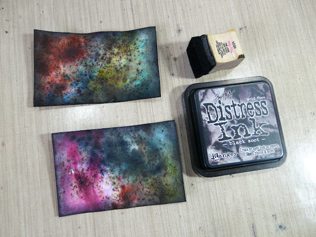
I resumed work on the Infusions mini-album today, and made the title pages for the various sections of Book 1.
I used the backs of some reject pieces from when I was making the sample sheets, and also cut new pieces of card to size for these. I began by making a title for the colours, made of Infusions from both sets, before remembering that I was going to make a separate title for Set 1 and Set 2, so I put this aside to use elsewhere. I had some fun with this, as I wanted to created rainbow striped effect, so used pieces of scrap paper to mask off areas where I didn’t want the Infusions to go.
I made two more pieces using colours from Set 1 and Set 2 respectively, and after drying them, distressed the edges with Black Soot Distress Ink – I followed this pattern for the remaining title pages, too.
Adding the text to the colours title pages, using a white Uniball Signo marker pen, and a black archival pen to fill the letters.
Here are the remaining title pages for Book 1.
The next one was done with a small flat brush and white acrylic paint, and outlined with black pen.
I also wrote the names of the colours on all the colours sample pages. I didn’t photograph these as they will be done when I photograph the finished project.
The next task will be to repeat the process for Books 2 and 3, and then I can start working on the tags.
Today I had an idea to deal with the problem of Book 2 being thinner than 1 and 3. It will be bound between the other two, and the addition of some 3-D paper flowers on its front cover will make quite a nice focal point, I think, and they won’t be squashed by the large cover which will bind the three mini-books.


Hi Shoshi, love the striped effect. Have a great week, Angela xXx
ReplyDeleteThese are looking lovely Shoshi! Looking forward to seeing more...
ReplyDeleteLove how the white lettering pops against the darker backgrounds!
ReplyDeleteBeautiful! I love the writing. It's so bold and stands out great against the fantastic backgrounds!
ReplyDelete