Showing posts with label Clear Stamps. Show all posts

Monday, 16 October 2017

Card Factory 2017

My stash of cards had pretty well run out so I really had to get down to making some more. I’ve decided I don’t really enjoy card making that much, so it’s a bit of a chore but I haven’t quite got to the stage when I’ve given up altogether and resorted to buying them!

Rather than falling into my usual trap of turning each card into a major work of art and taking far too long over it, I kept these ones simple. I shall continue to make special cards when the occasion demands, but the limited time I have available to spend in the studio (dictated by busyness elsewhere, and being too fatigued to do anything) is now dedicated to art projects I actually want to do, such as mixed media, books, experimenting with materials, etc.

Today I made seven cards. Six were more or less identical and were on a production line basis, and the other was a one-off which I made for our neighbour whose birthday is today.

I really struggled with these! Such a simple project, but if anything could go wrong, it did… I was feeling a bit brainfogged which really doesn’t help, and I made quite a few mistakes which were not able to be remedied unless I started again, so I pressed on. As a result, they are not my best effort!

I began by making a circular mask. Rather than setting the cutting machine up (couldn’t be bothered – too tired!!), I cut a 2-inch circle with a punch, which of course had to cut quite near the edge of the paper, so I stuck this with a glue stick to a larger piece, out of which I had cut a rough circle, larger than the punched circle. This is the back of it.

Turning it over, it provided enough margin not to allow anything to stray beyond the edges.

I had a couple of abortive attempts. I sprinkled Infusions (The Sage from set 1) through the mask onto two of the sheets I’d cut for the card toppers. In order to get enough coverage, they came out much too dark to stamp on. The one on the right was slightly lighter, and I thought I’d run over it lightly with a wet brush to make the texture smoother, but this was a disaster. Bin time.

It was hard to know what order to post the photos in, because in order to photograph the process I went through, I had to get ahead of myself a bit – I used the first successful circle as a guide for the rest. Here it is on my light panel, ready to use as a guide.

I lined up the next sheet over it, and you can just see the circle showing through.

I was then able to lay the mask on top. I had to do it this way because the mask was bigger than the small sheet and I had no way of lining it up otherwise.

I’d decided the only way I could get the effect I wanted, with good coverage of colour but with a little of the Infusions texture, was to ink the circle first with distress ink using an Ink Duster (I used Bundled Sage), and then add the absolute minimum of Infusions on top. This worked well.

Here is the distress ink going on, through the mask.

I picked up the whole thing and without disturbing it, carried it back to my main work area and sprinkled on the Infusions through the mask.

I spritzed it lightly with water without moving the mask.

I left it to stand for a minute or two and then blotted it off.

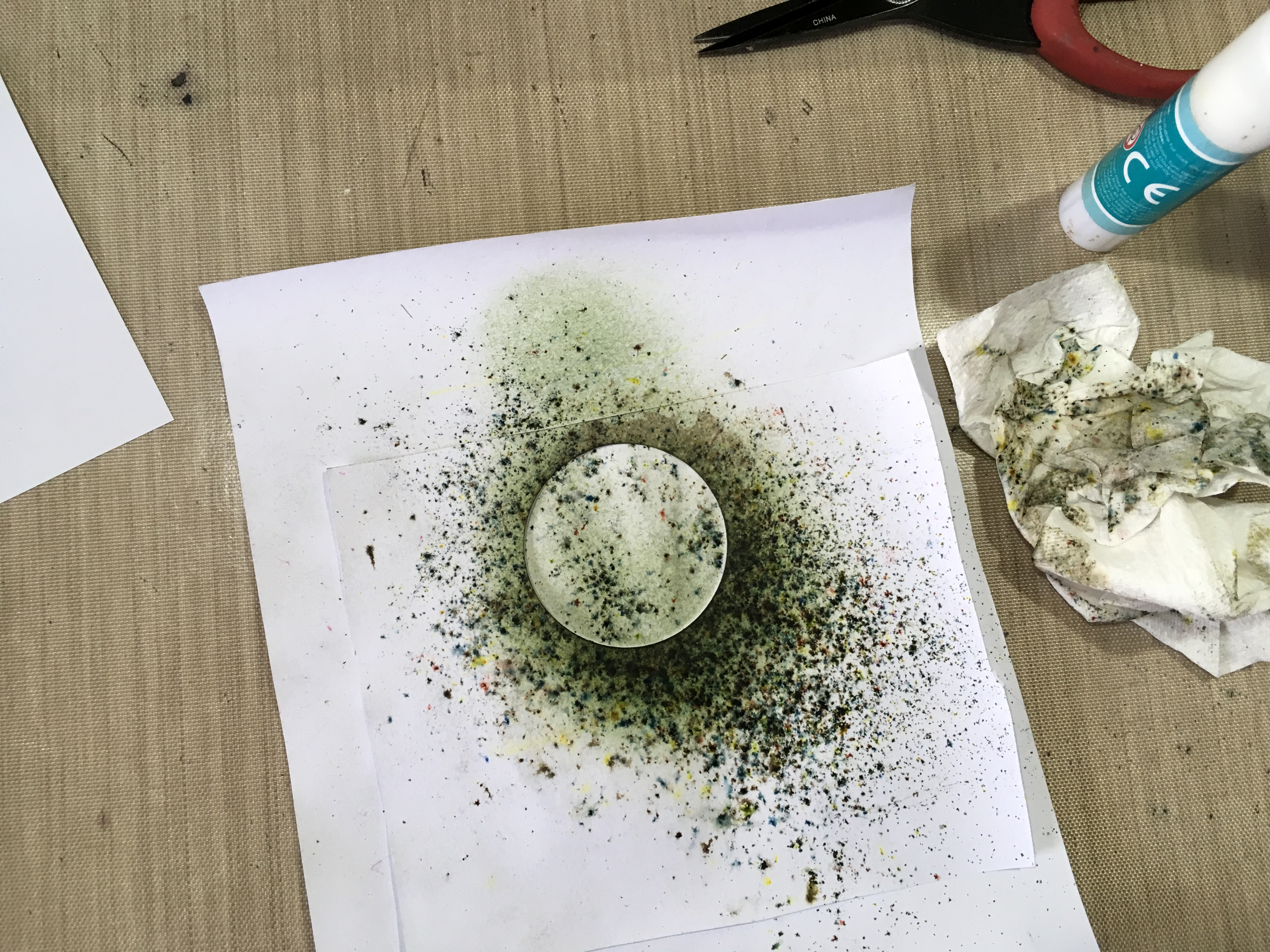
Finally, I removed the mask and dried it with my heat gun.

Here are the finished circles.

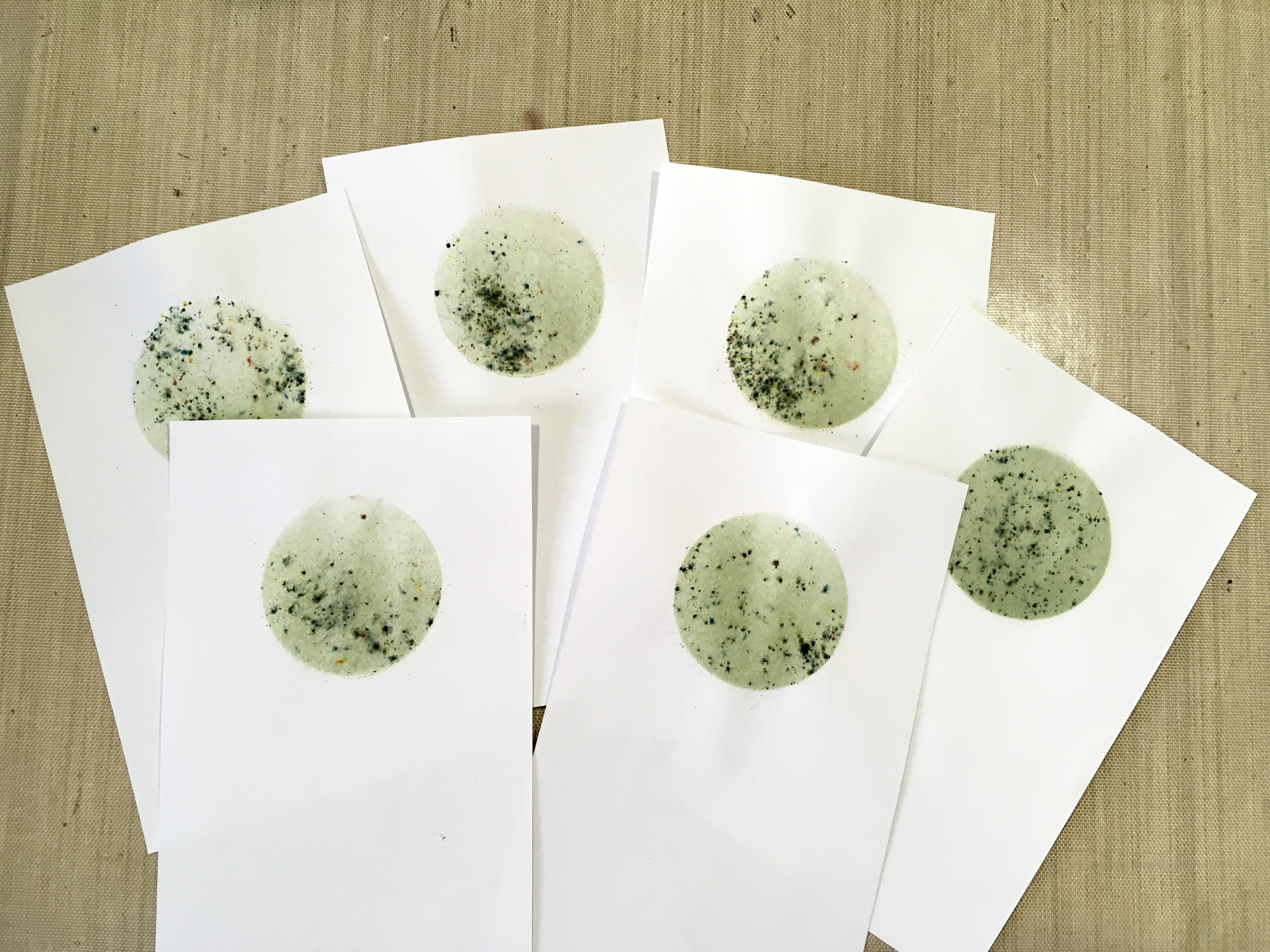
The problem was, I should have cut these pieces from card, and not from paper. The paper didn’t stand up too well to getting wet, and it buckled a bit.

I got out a selection of stamps, to choose which designs I wanted to use.

Using my wonderful new stamp platform, I stamped a single image onto each circle, using black archival ink.

This flower head one didn’t have a stem – you could use one of the stem stamps from the set but it meant setting it up on the stamp platform, and I thought it would be simpler just to draw one in with a black marker pen afterwards.

I have always been hopeless at stamping. The stamp platform is a marvellous tool for someone like me, but would you believe it… Only Shoshi could mess up a stamped image using a stamp platform!!! On the one in the next photo, the impression wasn’t quite good enough so I did it again, not realising that because I’d used paper instead of card, on the first impression the stamp stuck slightly and the paper moved fractionally when I lifted the lid of the platform. When I did the second impression, I got a doubled, blurred image! Grrrrrr. The tree branches weren’t too bad and I could get away with that, but the base part looked a mess. I blended it out with my alcohol pen and managed to salvage it!

Here are the other completed stamped images.

Finally, I matted and layered the toppers onto A4 white card folded to A5. Again, I experienced problems because the paper I’d used for the toppers was too thin, and I got a bit of buckling and creasing when I layered them, so the finish isn’t that great…

The final step was to stamp the sentiment on the bottom. I used my green archival ink for that, and again used the stamp platform.

One single finished card, which shows what this stamped image should look like when you don’t go and blur it!

I actually made our neighbour’s card before I did the set, and I should have inked first with distress ink and then added less Infusions, which would have given a better result, but you live and learn!

I began by taking a mask from my stash. Some time ago I made a card with lots of butterflies and frames on it, and had a frame-shaped piece of card with six butterflies cut out of it on the cutting machine. I laid this down on top of the card base and sprinkled Infusions over it (Violet Storms from set 1).

This is the finished card. I didn’t really like it much as the outlines were a bit blurred. I went around the outside of the frame and butterflies with my white marker pen, and then defined the wings of the butterflies with a silver glitter pen and the addition of some stickles.

The final step was to add a silver peel off for the sentiment, and this doesn’t show up very well! Not a great effort.

Why do I find cards so unsatisfying to make?? Perhaps if I enjoyed doing them more, I’d do them better!


PS Today is the second anniversary of the day I finished my chemo! Where on earth has the time gone?

Wednesday, 16 March 2016

WOYWW 354–New Stash, Music and Decorating

Since there is no change in my desk since last week and not wanting to miss out on the fun of WOYWW, I thought I would share the new stash I bought in February. It’s on my desk somewhere under the clutter, and even though it was “posed” for the photos, it’s been there on every Wednesday, so I think it just about qualifies for a WOYWW post!

I have been so busy with other things lately that none of this stash has yet seen the light of day or got its feet wet with ink!

After our wonderful Diana Taylor posted over recent weeks on using things she hadn’t used recently, including some fabulous flower stamps and dies which I quite fell in love with, I got the details from her and ordered them – they are the Heartfelt ones in the pink packaging. I also raided Ebay for some more new flower stamps because I don’t have many. The ones on the right are smaller than I’d hoped but they will still be useful, and the ones at the bottom can be mixed and matched for layering or making 3-D flowers if I want.

Flower Stamps and Perfect Pearls Feb 16

The box on the right is Bo-Nash Fuse It. It’s like the glue on the back of Bondaweb, but in powder form. I bought this for sprinkling on fused Angelina fibre so that I can apply it to projects – this stuff fuses beautifully to itself but not to anything else! Centre stage are the final Perfect Pearls to complete my set. Below the Perfect Pearls is a new pot of gold embossing powder.

While looking for new flower stamps, I found the new PaperArtsy Eclectica Collection by Lin Brown.

PaperArtsy Flower Stamps Feb 16

I also bought the companion stencils.

PaperArtsy Stencils Feb 16

I was totally blown away by these, particularly after viewing the Youtube video with all the projects people have made using them – I simply couldn’t resist!

https://www.youtube.com/watch?v=Yn8OdbuEUlA

One day (soon, I hope!) I shall get back into the studio and start playing with all these goodies.

Meanwhile, I am continuing to work hard on my guitar and singing technique. Here are my fingertips today – just over a fortnight on from when I started.

Finger Calluses 16-3-16

They are less tender now, and they look a lot worse than they feel! You can see that there has been some bleeding under the skin. They definitely feel harder now so I’m almost there!

I have been working on strengthening my left hand by squeezing the rubber ball my hubby used for the same purpose when he broke his wrist. Today I discovered some good exercises online for increasing flexibility, stretch and dexterity in the fretting (left) hand, with some excellent Youtube videos.

I have noticed since I started singing again that there is weakness in my middle register, and looking online again for advice on this, I came across Felicia Ricci, an amazing singing teacher who is enthusiastic and fun, and who explains things which are hard to put into words – I know I am going to benefit from this.

I spoke to my minister after church on Sunday and he said to email him when I felt I was ready to sing, and he’d fix it. It won’t be long now!

We are also about to redecorate our gloomy and cluttered sitting room, which doesn’t get a lot of natural light. At present the walls are cream, and we have far too much stuff in there. The lighting is very poor, so the electrician is coming to see if we can have wall lights. We are going to replace the cream paint with white, with small accents of a nice sunny bright orange. My hubby took me to B&Q yesterday (he said, “I know how to give a girl a good time” lol!) to buy the paint. I have ordered a new storage cabinet/bookcase to replace the ugly white painted shelves and this will be a lot less dominant. We spend a lot of time in there, and it certainly needs a facelift. Photos will follow! Now that Mum is no longer in the flat, we are going to move some of the stuff through there and use it while ours is out of action, which will be nicer in the evenings because it is at the back of house and gets the afternoon sun. Watch this space.

My hubby has been working hard in the garden and it’s all beginning to look lovely. We can’t wait for our rock plants to start growing. The water feature is looking great.

Happy WOYWW everybody and may we all have a fulfilling and creative week, whatever form that creativity may take!

Sunday, 11 October 2015

Brushos–First Experiments

Today I finally got around to testing my recently acquired Brushos. These crystalline waterclour pigments with their intense, vibrant colours proved a lot more difficult to use than I expected! I am sure I will get the hang of them eventually, and as you will see, my final results today were an improvement on my first attempts!

07 Four Trees with Distress Inks

I began by cutting five pieces of card measuring 5 1/2 x 6 1/2 inches – these will matt and layer nicely onto an A5-sized card. I stamped them with two stamps from the Inkylicious “Simply Trees” clear stamp set that I got recently.

12 Inkylicious Simply Trees Stamp Set

For my first attempt, I stamped the trees using sepia archival ink, but this proved to be not dark enough, so for the rest of the samples, I used black. The stamping didn’t come out terribly well, but I think this would be improved by using better-quality card. I had to touch up some of it with my permanent black drawing pens.

The colours of Brushos I chose were Dark Brown, Leaf Green, Scarlet, Yellow and Orange, to give an autumnal effect to my trees. I added the brushos by using a soft dry brush to pick up a few of the crystals from the pot, and tapped them onto the card. After this I spritzed it with water.

01 Trees 1

My first attempt was definitely underwhelming! I think I put on too much Brusho powder, and it didn’t really go where I wanted it! This stuff is really hard to control, but then that’s part of its attraction!

Attempt 2: This was definitely an improvement. With Brushos, less is definitely more! This girl definitely needs more practice!

02 Trees 2

For my third attempt, I used less again.

03 Trees 3

Fourth attempt: We’re definitely getting somewhere now. You really do need the absolute minimum of Brushos to get a good effect. Once I had dried the samples, I put a small quantity of the Leaf Green and Dark Brown brusho crystals onto my craft mat and mixed them with some water, using a fine brush, and then painted on some foreground.

04 Trees 4

My fifth attempt I was pretty much satisfied with. I quite like the foreground on this one, too.

05 Trees 5

In each case, I had to use a bit of judicious blotting with kitchen paper to remove excess water and Brushos, in an attempt to control where most of the colour ended up.

Here are attempts 2-5 as a group, the only ones I feel I could actually use, although #2 is debateable. #1 is definitely a reject and not included.

06 Four Trees

I thought that the addition of a little distressing around the edges might improve things further, and provide a little cohesion to the designs. Using a home-made ink blender, I applied Forest Moss distress ink for the bottom half of each one, and Vintage Photo distress ink for the top halves.

07 Four Trees with Distress Inks

Here are the completed pieces in order. First: sample #2. I am still not sure about this one. I shall matt and layer it and see how it looks, but it may join #1 as a reject.

08 Trees 2 Complete

Sample #3.

09 Trees 3 Complete

Sample #4.

10 Trees 4 Complete

Finally, sample #5.

11 Trees 5 Complete

Watch this space to see these pieces matted and layered, and made up into cards.

Thursday, 17 September 2015

Priming Clear Stamps

The first of two posts for today.

I recently acquired some stamps from Inkylicious, a set called “Simply Trees.” Their website wasn’t terribly clear, and while some stamps were listed as “clear polymer stamps,” some were not described as rubber or clear, and I assumed that those not labelled “clear” would be cling-mount rubber stamps. When they arrived, they turned out to be clear. I am not normally a great fan of clear stamps because I’ve never got such good results with them as I do with rubber stamps – not only was the impression a bit ill-defined, but I have had awful trouble with the ink balling up on the stamp and giving a mottled result.

I knew you were supposed to prime them in some way but apart from rubbing them with a pencil eraser, I didn’t know much else, so today I decided if I am going to use these stamps and make them work as well for me as possible, I’d better find out how to do it.

I found some videos on Youtube and some tutorials on Splitcoast Stampers, and following their advice, I stamped at each stage in order to compare the results.

Most people seem to think that Versafine ink pads are best for clear stamps but I don’t have any, and I love stamping with Distress Inks – people say these are not suitable for stamping but I’ve never had any problems with them – I think they are brilliant! I grabbed one of my new DI pads that arrived with the stamps – Blueprint Sketch (OK, perhaps I should have grabbed a green one since all the stamps are trees lol!) and ended up stamping a series of blue trees. Oh well, the experiment worked, at any rate!

02 Inkylicious Simply Trees Stamps Primed

My first stamping was with the stamp straight out of the packet, with no treatment. It was OK, but I could definitely see an improvement after I’d done some priming.

The first treatment was with Stazon Stamp Cleaner. I was a bit reluctant to try this even though it was recommended by one person, because I’d read somewhere that this stuff could damage clear stamps and was designed only for rubber, so I only tried this once, and abandoned this treatment thereafter.

The second treatment was to rub the stamp all over with a pencil eraser, clean off the residue and stamp. To clean off the stamp, I used my stamp cleaning pad which is like a large flat kitchen scrubber on a foam backing – a brilliant tool.

The third treatment was to rub the surface of the stamp gently with a nail file – this file has sapphire dust stuck to the surface and is quite fine. Again I dusted off the residue using my stamp cleaning pad.

The fourth and final treatment was to rub over the surface of the stamp with an anti-static bag, again cleaning off any residue.

I was very pleased with the result of all this priming, so, omitting the Stazon stamp cleaner, I proceeded to prime the rest of the stamps in the set, using the pencil eraser, nail file and anti-static bag, and printed them all off to see how they came out.

The stamps looked much less transparent after priming, but they are still clear enough to see where to place them accurately.

Another piece of advice I found was not to put too much pressure on the stamp when using it – they are a lot softer than rubber stamps, and you can squash them a bit if you press too hard, which gives a less clear result. Also, it is good to stamp using a foam pad underneath the cardstock – a friend recently sent me a lot of stash and it included the pink foam pad you can see in the photo below – it feels exactly like fun foam but is much thicker. If I remember, I think I may use this with normal rubber stamps in future, too, because it worked so well.

I got very good results indeed, following all this advice, and may be on my way to becoming a convert to clear stamps! They do tend to be cheaper than rubber ones, and have the advantage that you can see where to place them with a high degree of accuracy. Maybe it’s time to dig out my old clear stamps that I got when I first started, and give them a new lease of life.

01 Equipment

In the photo, you can see that the stamps now have a somewhat milky appearance as a result of their surfaces being roughed up.

I hope others find this information as helpful as I did.

Related Posts Plugin for WordPress, Blogger...