Showing posts with label Tim Holtz Paper Stacks. Show all posts

Saturday, 10 June 2017

Second Wind–Third Part

The completion of the project. I don’t think I’ve ever completed a project so quickly!

Yesterday I made the cover and did the binding.

These are the materials – originally I thought I might use some of the inked kitchen paper but in the end decided against it. The patterned papers are from my stash, both from Tim Holtz paper stacks; the purple one is the back of a printed sheet that I knew I would never use. If I hadn’t had this, I would have inked some paper myself, but I thought this was a good opportunity to start using up some of my stash that’s been hanging around for several years! For the cover boards, I used cereal packet card.

I also found a sheet from a paper stack I was given ages ago, which again I thought I’d probably never get around to using – the design on it reminded me of raindrops so I thought that would do for the back! I forgot to photograph it with the above, but you will see it in a minute.

To help me cut the world map sheet where I wanted it, I made a frame out of scrap paper. The hole is the size of the finished cover, and the surround being the amount needed to fold around to the back. I chose an area on the map where hurricanes are prevalent.

The papers cut to size.

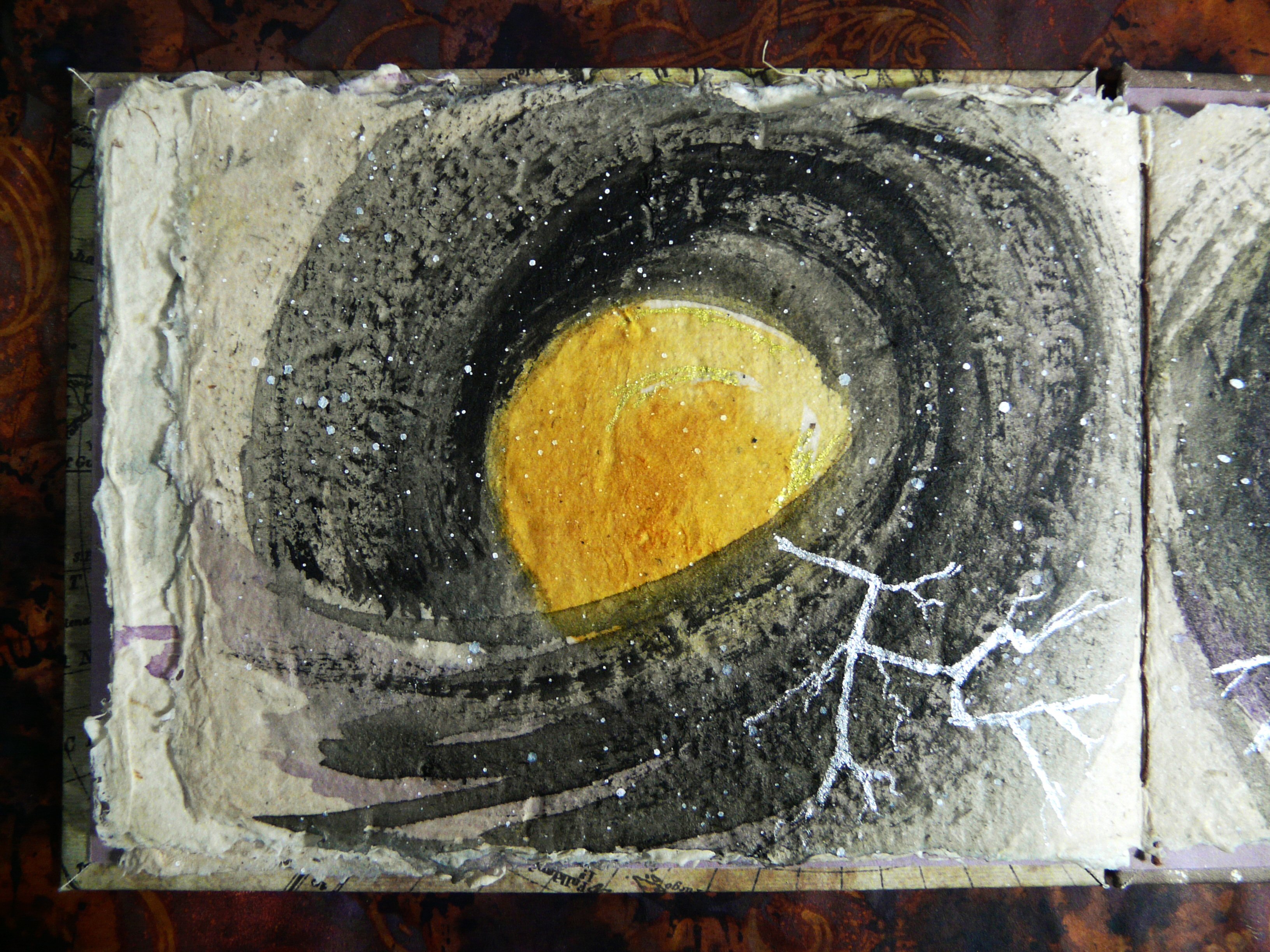
I stuck the papers down onto the card using a glue stick, and then turned them over, cut off the corners, and stuck the folds over using double sided tape.

The finished cover boards.

I used the purple paper for the end papers. I stuck these inside the boards with double sided tape. I am pleased with this choice of paper because it really brings out the touches of purple on the pages.

The covers ready for binding.

The beginning of the binding process, with the boards and pages marked and pierced ready for the waxed linen thread I used.

After this I forgot to photograph the binding process. This was my first attempt at a Coptic binding and it was great fun to do. The advantage of this binding is that the pages will fold absolutely flat as you open the book, making it ideal for art journals etc. You can also add as many pages/signatures as you like. Because there is no cover over the spine, the stitching is visible, and can be made very attractive. As it was my first attempt I decided to keep it simple, but there are all sorts of fancy variations you can do, to make a decorative stitched spine. There are plenty of images online.

I followed along with a brilliant Youtube tutorial and once I got into the swing of it, it was really easy. https://www.youtube.com/watch?v=Z1cTB6_4w5E

After the binding was completed, I added the title on the front of the book, using my Uniball Signo white marker pen, and outlined the letters with a medium sepia archival pen.

Here is a view of the stitched spine of the Coptic binding.

The back of the book, with my blog details.

To finish the cover, I added some shading under the title to make it stand out better, using my Derwent Graphitint in Warm Grey, and blended it with a fine wet brush. I went around the edges of both front and back covers with Black Soot Distress Ink, using a hand-made blending tool.


Here is the flip-through of the whole completed book.


As a recap on the thoughts behind this project, I am pasting in what I wrote at the end of the first part.

I have been thinking about “second wind” in the context of my own life. It’s funny how while its primary meaning is something destructive and terrifying, this expression usually means something quite positive when used in a metaphorical sense. Since my cancer, which necessitated the removal of my entire colon which was already diseased with ulcerative colitis, I have definitely come into my “second wind” in a positive sense, and am enjoying many activities I thought were lost to me, and many new ones besides. The negative aspect of my second wind struck me early this year when I had a blockage and was admitted to hospital for emergency surgery. The eye of the storm was the whole of 2016 when I was pretty well, and I thought that was the end of it, not realising that the second wind was just around the corner.

Cancer very often leaves a swathe of destruction in its path, both physical and emotional, and yes, there has been destruction in my case, but what remains has enabled me to rebuild my life from the ruins, and what I now have is very much better than what I had before. While I was going through the thick of it, somehow, at the centre, I always had my own personal “eye of the storm” where I had peace and joy, and remained positive. I hope my little album in some way depicts this journey, as well as illustrating the terrible beauty of one of the most destructive weather events on earth.

I hope you have enjoyed this little project. I am really keen to do more books in the future – in the meantime I have my Infusions mini-album to finish!

Thursday, 29 May 2014

Altered Pizza Box

Edited – now with video.

A mixed media project. I am giving away one of my flower painted Ikea mirrors as a house-warming present, and recently discovered that it fits exactly inside a 10-inch pizza box. I thought the box needed a bit of decoration to make it a slightly more acceptable wrapping, and I ended up making a full mixed media project out of it!

I got a bit carried away and forgot to take any photos during the making, but I did video the whole process.

I started by covering the whole of the outside of the box with gesso, and then had a rummage in my Tim Holtz papers – they’ve all got a bit muddled up and I’m not sure which stack they come from – either Crowded Attic or Lost and Found, but it doesn’t really matter – they’re all nice and vintage. I found some nice faces and tore them out and distressed the edges with my distressing tool, and stuck them down onto the box with PVA adhesive.

I also stuck down some ripped up corrugated cardboard with some of the surface paper torn away, which gives a gorgeous texture. Once the PVA was dry, I painted these pieces with gesso, and then began painting the whole surface with acrylics.

I chose a blue and green palette, and did some dry brushing with white acrylic, and once I’d got the effect I wanted, I added some iridescent gel medium which gives a gorgeous shimmery surface, and then some pearlised acrylic ink, concentrating on the textured corrugated parts. The whole thing was extremely shimmery by this time.

I created some text, “Home is where the heart is” by cutting out some words and letters from scrap printed paper in my stash, and stuck these down onto a further piece of scrap paper with regular matt gel medium, which I also used to stick the pieces down onto the surface. Before this I coloured them with Victorian Velvet Distress Ink.

Once they were laid down, I took an old credit card and added some crimson acrylic paint with the edge of the card dipped in the paint, creating frames around the words and around the face pictures. I then added some more lines using my white marker pen.

To form a border, I used more of the crimson acrylic paint, and also some dark blue, and once the border design was laid down, I went round the edges and embellished the border with the white marker pen, and finally added some shadows with a mixture of Payne’s Grey and white acrylic paint.

The final touch was to add some Treasure Gold gilding wax to the raised texture. A really shiny, shimmery effect!

Once the outside was dry, I painted the whole of the inside roughly with gesso. This will be fine once there is tissue paper inside the box, wrapping the mirror.

Here is the finished box, propped up with the edges of the lid showing. I painted these with a mixture of green acrylics.

01 Box Open

The box closed:

02 Box Closed

The sides of the lid go inside the box, and I painted the sides of the base with rich blue acrylic paint.

Now for some details. This is the bottom left corner. You can see one of the pictures I laid down, and also some of the corrugated cardboard. I love the effect of the top surface layer of paper being partially ripped away.

03 Detail 1

One of the face pictures. They are pretty subtle with the iridescent gel medium, and they also reflect the light so it’s a bit difficult to see them in the photos.

04 Detail 2

05 Detail 3

Finally a detailed shot of the text.

06 Detail of Text

I think you can see how shiny and shimmery the surface is in this photo.

A fun project to do, and I completed it in an afternoon. One day I would like to paint and embellish the rest of my pizza boxes, which are used to store various materials in my ARTHaven.

Saturday, 18 January 2014

Dad’s Album–A Wee Sporran

I’ve been working on the album I’m making about my dad’s life. Sorting through the box of papers I found quite a bit about his mother’s side of the family, so I have decided to extend the “Ancestors” page to cover my Scottish ancestry as well. Being primarily about my grandmother, this page has a slightly more feminine appearance than the rest of the album, with a distinctly Scottish flavour.

I have now printed out the scans of the various artefacts from the other day, ready to be cut out and used on the project.

12 Tartan and Scanned Objects

I also printed out a couple of sheets of tartan. I chose the ancient hunting tartan of Clan Fraser rather than the dress tartan, as it is much softer and more subtle in colouring – the hunting tartans, to my mind, are more attractive. My grandmother was from this clan, whose area covered the north eastern Highlands, including the Aberdeen area. She had a very distinctive accent found nowhere else but her own small area on the River Spey.

13 Tartan Images

This is the underside of the large envelope flap, now painted black. If you look carefully you can see the small circle of card which I glued over the brad back.

14 Inside of Flap Painted

The brad and thread fastening on the front. For the envelope flap I have chosen a Tim Holtz sheet from his paper stack “Lost and Found,” showing vintage medicine labels.

15 Envelope Brad and Thread Closure

I used the orange ultra-sticky double-sided tape to stick the envelope front down.

16 Inside of Envelope with DS Tape

I  bought several rolls of this from a craft show, and discovered that left stacked up, they all stuck together, and I had an awful job separating them, but managed eventually by inserting the blade of a knife between the rolls and gently levering them apart. This stuff is seriously sticky! I don’t know if anyone else has experienced this problem, but I decided that to prevent it happening again, I needed to keep the rolls separate, and I did this with pieces of waxed paper – I save this whenever I can as it has loads of uses, from postage stamp sheets, the backing of self-adhesive labels, etc. etc.

Orange DS Tape with Waxed Paper

Before sticking the envelope front down, I took two more sheets from Tim Holtz’s “Lost and Found” to create a couple of fold-out sheets for photos, journaling and embellishing. I cut them the exact size of the page minus the binding, adding half an inch for the hinge. I scored along this line and stuck the two pages together with my ATG, and then inserted them underneath the envelope front, sticking them down onto the envelope back, also using the ultra-sticky double-sided tape.

Once this was done, I was able to stick down the envelope front, trapping the half-inch hinge of the pages between the envelope front and back.

17 Secondary Pages in Place

Here are the pages opened, revealing the plain backs of the Lost and Found sheets, both of which have sewing themes on them. My grandmother was a keen needlewoman, and when we cleared her house after her death, I inherited a huge quantity of sewing threads and equipment, and even after many years, I am still using much of it.

18 Secondary Pages Open

This is what the pages look like closed. You can see the black binding piece on the right. On the back of this whole piece is the first “Ancestors” page which concentrates on my grandfather’s side of the family.

19 Secondary Pages Closed

I trimmed the tartan pieces to the sizes I wanted, and pleated one by scoring alternately at 1 inch and 1/2 inch, using my Scor-Pal score board.

20 Pleating the Tartan

I made a series of parallel cuts from the edge of the other piece to a distance of half an inch, each 1/16 inch apart, and then ruffled these with my finger to separate them, and create the illusion of the fringe on the apron of a kilt.

Laid over the pleated piece, here is a mock-up of the kilt, with the template I drew of a sporran.

22 Kilt Mock-Up with Sporran Template

I took a small piece of scrap card and embossed it, using the Tim Holtz Texture Fade embossing folder “Cracked.” I cut the shape of the top of the sporran from this, so that the lines radiated outwards. I painted the card with black acrylic paint, and when dry, I dry-brushed it with silver acrylic paint, as per Lindsay the Frugal Crafter’s recent tutorial on faux metal – a brilliant tutorial – so simple yet so effective, with a hundred uses.

23 Sporran Top

I then took a piece of heavy scrap cardstock and created a piece of faux leather from it, from the instructions which were part of Andy Skinner’s online course “Timeworn Techniques,” which I downloaded before we moved house. The results are quite astonishing – not only does it look like real old leather, but it feels like it too! I used the same Tim Holtz embossing folder for this as I used for the sporran top, to give a nice crumpled distressed look.

24 Faux Leather for Sporran

Here is a mock-up of the wee sporran. I created three tassels from silver thread that I wrapped around a narrow piece of scrap card to get the length. The tops of the tassels were made from triangles of craft metal rolled around a cocktail stick, and the thread on the top of each tassel was threaded through the top of this and passed through a hole in the faux leather, secured with a knot on the back, and secured by glueing another piece of cardstock on the back of the sporran piece and trimming it close to the edge. The undersides of the metal tubes were stuck down onto the surface of the faux leather with Scotch quick-dry adhesive to keep the tassels in place on the surface.

25 Sporran

I pierced a line of holes around the edge of the sporran using my Tim Holtz ruler which has holes at 1/16 in intervals along its length, with the aid of a piercing tool, and then ran a line of backstitch through these holes with waxed carpet thread, securing the ends on the back as I did for the tassels.

The “metal” top of the sporran is just laid in place on the above photo. I have glued it onto several thicknesses of cardstock to make it nice and thick, and it will be attached to a tag which will go inside the sporran, and be removed with the “clasp” that I shall form on top of the faux metal piece. The tag will have a photo and/or journaling on it. The sporran will be glued to the kilt apron and chains will pass from the top on each side, to the edges of the kilt pieces.

Watch this space for the continuation of this Scottish themed page and the completion of the kilt and wee sporran.

Related Posts Plugin for WordPress, Blogger...