Showing posts with label Textures. Show all posts

Sunday, 11 June 2017

Pottering in the Studio

I really wanted to do some art today, but before attempting anything, I just knew I had to have a clear-up. The mess in my studio was really getting to me! There was stuff encroaching on my main work area, restricting the amount of room  had to work. As I went around the room from the door, on around to the further corner where the drawing area is, I cleared each surface and found stuff that hadn’t been put away since January when I was completing my Mamhead Woods album!! OK, I was ill soon after that and spent 2 1/2 weeks in hospital and then some considerable time recovering, but then I got very busy with other things and kind of got used to the messy state of things over the other side of the room. Funny how you can cease to notice mess after a while… Anyway, having just finished my Second Wind album, I knew I should tidy up before resuming the Infusions album.

I didn’t take any photos of the messy room till it was too late! Believe me, it was messy. Here are the tidy photos, which are a lot nicer to look at!


It feels a lot more restful in there now, and more conducive to creativity.

While tidying up, I’d found one or two bits and pieces that I decided to deal with right away. Over the past few weeks I’d set aside some different materials that I wanted to heat, to see how they would melt, and whether they would be useful in art projects. The first was some fruit labels. I also had a piece of damp proof course that the damp expert kindly cut off his roll for me to experiment with – this black shiny plastic has a rather attractive diamond pattern on it and I wanted to see if it would melt.

The fruit label shrank up very nicely and got quite wrinkled. I think this might be useful for texture, and it could be gessoed before painting. The damp proof course stuff also shrank up quite a lot, but it got very sticky and tended to stick to itself. I didn’t think it would be so useful in its melted state, but unmelted, I think it could have its uses.

I also tried melting a purple wristband that I had from a conference I attended recently – everyone was given one of these so that they could come and go freely, but be able to prove easily that they were paid up delegates when they came back in. I had been very careful with mine, thinking it was paper and being afraid to rip it, but at the end, when I tried to rip it off my wrist, it wouldn’t, which made me think that perhaps it was made of Tyvek, so I cut it off and saved it, thinking I would melt it and see.

Melting it proved my theory to be correct. This is definitely Tyvek!

All these little bits have now gone into my melted samples box.

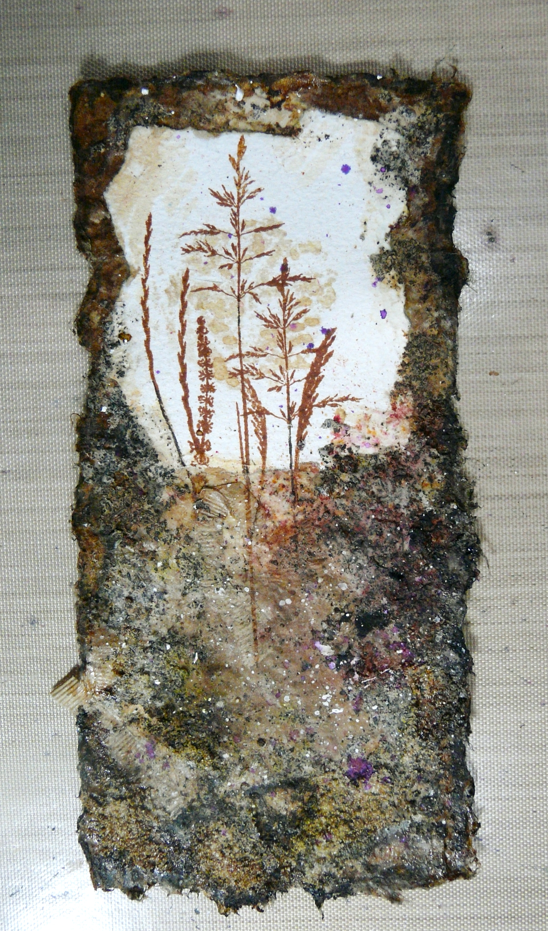
A couple of weeks ago I was given some gingko leaves and I’d put them in my flower press. I got them out today. They have pressed beautifully but they appear to have parallel lines on them from the corrugated cardboard in the press, despite each layer of cardboard being separated by layers of absorbent paper, between which you place the flowers for pressing. I am hoping these lines will disappear once the leaves have been exposed to the air for a bit and had a chance to dry out. I have yet to discover what I am going to use these for. I am thinking of asking for some more, to try doing some eco-printing with. I simply love the shape of these leaves – so unusual.

By the time I’d done all this, I was very tired and my back was starting to ache, so I abandoned any thought of doing any art today. At least the studio is nice and tidy now, and I can begin again when I like.

We had a busy day today – I sang at church, and then we had to rush home and I had to get lunch on quickly because my hubby was going out. Most of the afternoon was taken up with clearing up the kitchen and finishing the rest of the laundry and doing the ironing.

I’ve got a nice sense of achievement now.

Thursday, 8 June 2017

Second Wind–First Part

WOYWW visitors – please see previous post.

I know this was supposed to be the year of the UFOs (UnFinished Objects) and that I wasn’t supposed to be starting any new projects until I’d made good headway on completing ones I’d already started, but sometimes the creative urge just grabs one, and one has to give in!

I have just finished listening to the audiobook version of Dick Francis’ novel Second Wind, in which a meteorologist flies through the eye of a hurricane. Apparently after the complete calm of the eye of the storm, when the second half of the circular weather pattern passes over, this is known as the “second wind” and it can be even more destructive, finishing off anything left after the destruction of the first.

This captured my imagination, and I thought I would like to make a little album just with a series of simple brush-stroke illustrations in an attempt to capture it. In my stash I have quite a few folded sheets of hand-made paper which I think were the covers of some wedding service sheets that I picked up after a service. I tore them in half horizontally against a ruler so that I could mimic the existing deckle edge of this gorgeous natural-coloured and textured paper.


I did some experiments because I knew it was likely to be highly porous, and I didn’t want any bleed-through.


With just one coat of clear gesso, there was still considerable bleed-through, but with a second coat, this seemed to solve the problem, especially if I dried the piece fairly quickly with my heat gun and didn’t leave it sitting around saturated for too long. I also tried Finnabair 3-D matte transparent gel medium, some professional artists’ fixative in an aerosol can provided by my hubby, my own casein-based manual pump fixative, and some Rustoleum Crystal Clear sealant spray, also in an aerosol can (that stuff stinks!). This was the only other substrate that allowed no penetration, so I decided on two coats of clear gesso, which is a lot more user-friendly.

All substrates allowed the application of water-based paints/inks without beading, and in every case it was possible to reactivate the paint with water after drying. The clear gesso gives quite a tooth, but since the paper is textured anyway, I didn’t think this mattered.

It was important that the chosen substrate was transparent, as I didn’t want to cover the fibrous texture of the paper, or its natural, undyed colour.

As for the painting, I did a series of test pieces on scrap printer paper, which buckles horribly when wet, and does not allow one to blend the watercolours after they have been applied, but it was just to give me an idea of the sort of thing I wanted to paint. I used watercolours, and towards the end, added some Distress Stains.


Once they were done, I wasn’t very pleased with them, and decided that less was more, and that once I began on the hand-made paper, I would keep the brush strokes to a minimum, and try to simplify the designs.

I have chosen a limited palette: black, yellow and orange, and little touches of purple. I decided to use the Distress Stains exclusively in the end, as the colours are more intense. The colours I chose were Black Soot, Mustard Seed, Wild Honey, and Dusty Concord. I smeared these onto my craft sheet and picked them up with a brush – for the detail I used several sizes of smaller round brushes, and for the black swirls, a large fan brush, wetting the brush a little first.

Here are the pages in order. They show first of all a peaceful scene, and then the arrival of the hurricane, the first wind of which increases in size and strength.


The first wind then begins to diminish as we approach the eye of the storm.


For the eye of the storm, I made this picture the only double page spread of the album. This illustration is not only the physical centre of the book, but is also the focal point of the concept.

The following pages show the arrival of the second wind, its development and its diminution.


The final picture shows the emergence once again of a peaceful scene in the aftermath of the hurricane.

Watch this space for further progress on this little book. I intend to add some more detail, maybe in the form of small amounts of acrylics, including some spattering, and possibly some touches of gold, using embossing, foiling, gilding flakes or gilding wax, and maybe some archival marker pen.

For the binding I am planning on my first attempt at a Coptic binding, using undyed waxed linen thread, and using some sort of boards for the front and back cover.

I have been thinking about “second wind” in the context of my own life. It’s funny how while its primary meaning is something destructive and terrifying, this expression usually means something quite positive when used in a metaphorical sense. Since my cancer, which necessitated the removal of my entire colon which was already diseased with ulcerative colitis, I have definitely come into my “second wind” in a positive sense, and am enjoying many activities I thought were lost to me, and many new ones besides. The negative aspect of my second wind struck me early this year when I had a blockage and was admitted to hospital for emergency surgery. The eye of the storm was the whole of 2016 when I was pretty well, and I thought that was the end of it, not realising that the second wind was just around the corner.

Cancer very often leaves a swathe of destruction in its path, both physical and emotional, and yes, there has been destruction in my case, but what remains has enabled me to rebuild my life from the ruins, and what I now have is very much better than what I had before. While I was going through the thick of it, somehow, at the centre, I always had my own personal “eye of the storm” where I had peace and joy, and remained positive. I hope my little album in some way depicts this journey, as well as illustrating the terrible beauty of one of the most destructive weather events on earth.

Wednesday, 24 May 2017

Mixed Media Anniversary Card

Today is our 31st wedding anniversary. Goodness, is it really that long? What a lot has happened since we got married!

Last night, still catching up with myself after my busy week last week, and then having to rest a lot, I finally sat down in my studio and got a card made for my lovely hubby. I originally planned on making something quite simple because of time, but while I was resting, I came across Marta Lapkowska, a brilliant Polish mixed media artist, on Youtube, and some of her fabulous video tutorials on creating texture from anything you could think of – an absolute gift to a complete texture junkie like Yours Truly. https://www.youtube.com/watch?v=cAOJwdQqokQ and this inspired me to do something a little more challenging.

What fun I had!

Here’s what I did, step by step.

First of all, I selected one of my sheets of watercolour paper with stains on it from drying teabags, and tore one out.

In my stash I’ve got quite a few sheets of hand-made paper which I think were originally part of some wedding service sheets that I collected up after a wedding service once. I knew they’d come in useful for art – they are gorgeously soft and textured. Again, I tore out a piece, to give a nice uneven edge, and I was delighted to find that the tearing gave almost the same edge as the natural deckle edge of the hand-made paper.

Next came the teabags. I selected a few from my stash.

I cut them open and put some of the tea on my palette. The rest was thrown away. I should really have a blitz and empty all my stash of teabags (I’ve got hundreds!) and save the tea to put on the garden! Also, the teabags would take up a lot less room without the tea in them. One day, one day…

I mixed the tea with some Polyfilla One Fill, my preferred (cheap) texture paste. It was pretty dry so I added some water.

I opened up the teabags by tearing them, and saved the cut off strips which were interestingly textured.

I applied a few of the teabags to the bottom half of the hand-made paper piece, using soft matte gel medium.

I then applied the tea/Polyfilla mixture in places, to add texture, being careful not to obscure the more interesting part of the teabag layer. I wished I had screwed the teabags up more, instead of laying them down flat, as I would have got more interesting texture that way.

After drying this, I thought it needed a bit more texture added, so out came the coarse pumice gel medium – I love this oh-so-gritty stuff!

Using soft matte gel medium, I stuck down the teabag stain piece to the top of the hand-made paper, and also added a bit of this gel medium over the textured part, to make sure that it didn’t flake off.

Time for stamping. I am soooo glad I bought my wonderful Tonic Stamp Platform! I’ve never been very good at stamping and this tool makes it so easy. Also, I was able to do several test pieces (e.g. on the left of the picture) to experiment with the layout of the grasses stamps – this set is from Inkylicious, and is “Create a Collage – Meadow.” I did the stamping in several stages so that I could get the layout I wanted, using sepia archival ink.

I stamped so that the stems of the grasses extended below the bottom of the teabag stain piece, and extended them, and filled any gaps, with my fine sepia marker.

Here’s a detail shot of the stamping.

Painting with tea and coffee! I made up some strong tea and coffee for this.

Painting with the tea. I used a wide fan brush for this and dabbed it on more or less all over the background piece.

Using a finer brush, I painted the coffee around the edges and to emphasise some of the texture a bit more. I had to do this several times, drying in between with my heat gun – I don’t think I made the coffee quite strong enough.

At this stage I also painted a bit of tea over the teabag stain behind the grasses to emphasise it, as this was getting a bit lost in the design.

I thought the background needed a bit of colour variation, so I used some Infusions. To the bottom left I added some Lemoncello from set 1, and to the right, some Rusty Car from set 2, and these certainly added a bit of richness and depth.

I felt a distinct need to add a bit of complimentary colour to all this brownness, so I dug out my Crushed Grape Dylusions spray ink and spattered some of that on, and I think it improved it a lot.

The edges needed darkening, so I did this with some black acrylic paint. I also added some of this around the texture to emphasise it more.

I thought the whole thing needed lightening a bit, so I masked off the teabag stain piece at the top, and spattered the rest with white acrylic paint.

This was the result.

Originally I wasn’t going to put a sentiment on the outside of the card, but there needed to be something to balance the design, so I decided to add one. I went through my pile of rejects and spares from my Infusions mini-album project and found this one that exactly complemented my design. I tore off the bottom and wrote the text using my Uniball white Signo marker pen, and then darkened the edges, especially along the white torn top edge, with tea. I stuck this to the front of the card with regular matte gel medium, dabbing carefully over the text to prevent the water-soluble white from smudging, and afterwards touching this up where necessary.

To create the card base, I cut a piece of heavy white card and softened the edges with some more tea.

Inside, again using my wonderful stamp platform, I stamped the sentiment with sepia archival ink, using the “Memorable Moments” stamp set from Stampin’ Up.

To add a bit of interest, I made a couple of wide brush strokes across this sentiment with tea, using the fan brush.

I assembled the card using Scotch Quick Dry Adhesive which is a really good strong wet glue.

The finished card.

My hubby loves it!

Here it is, side by side with the other card I made recently, for his birthday last week.


Related Posts Plugin for WordPress, Blogger...