Showing posts with label Dylusions Ink Sprays. Show all posts

Wednesday, 24 May 2017

Mixed Media Anniversary Card

Today is our 31st wedding anniversary. Goodness, is it really that long? What a lot has happened since we got married!

Last night, still catching up with myself after my busy week last week, and then having to rest a lot, I finally sat down in my studio and got a card made for my lovely hubby. I originally planned on making something quite simple because of time, but while I was resting, I came across Marta Lapkowska, a brilliant Polish mixed media artist, on Youtube, and some of her fabulous video tutorials on creating texture from anything you could think of – an absolute gift to a complete texture junkie like Yours Truly. https://www.youtube.com/watch?v=cAOJwdQqokQ and this inspired me to do something a little more challenging.

What fun I had!

Here’s what I did, step by step.

First of all, I selected one of my sheets of watercolour paper with stains on it from drying teabags, and tore one out.

In my stash I’ve got quite a few sheets of hand-made paper which I think were originally part of some wedding service sheets that I collected up after a wedding service once. I knew they’d come in useful for art – they are gorgeously soft and textured. Again, I tore out a piece, to give a nice uneven edge, and I was delighted to find that the tearing gave almost the same edge as the natural deckle edge of the hand-made paper.

Next came the teabags. I selected a few from my stash.

I cut them open and put some of the tea on my palette. The rest was thrown away. I should really have a blitz and empty all my stash of teabags (I’ve got hundreds!) and save the tea to put on the garden! Also, the teabags would take up a lot less room without the tea in them. One day, one day…

I mixed the tea with some Polyfilla One Fill, my preferred (cheap) texture paste. It was pretty dry so I added some water.

I opened up the teabags by tearing them, and saved the cut off strips which were interestingly textured.

I applied a few of the teabags to the bottom half of the hand-made paper piece, using soft matte gel medium.

I then applied the tea/Polyfilla mixture in places, to add texture, being careful not to obscure the more interesting part of the teabag layer. I wished I had screwed the teabags up more, instead of laying them down flat, as I would have got more interesting texture that way.

After drying this, I thought it needed a bit more texture added, so out came the coarse pumice gel medium – I love this oh-so-gritty stuff!

Using soft matte gel medium, I stuck down the teabag stain piece to the top of the hand-made paper, and also added a bit of this gel medium over the textured part, to make sure that it didn’t flake off.

Time for stamping. I am soooo glad I bought my wonderful Tonic Stamp Platform! I’ve never been very good at stamping and this tool makes it so easy. Also, I was able to do several test pieces (e.g. on the left of the picture) to experiment with the layout of the grasses stamps – this set is from Inkylicious, and is “Create a Collage – Meadow.” I did the stamping in several stages so that I could get the layout I wanted, using sepia archival ink.

I stamped so that the stems of the grasses extended below the bottom of the teabag stain piece, and extended them, and filled any gaps, with my fine sepia marker.

Here’s a detail shot of the stamping.

Painting with tea and coffee! I made up some strong tea and coffee for this.

Painting with the tea. I used a wide fan brush for this and dabbed it on more or less all over the background piece.

Using a finer brush, I painted the coffee around the edges and to emphasise some of the texture a bit more. I had to do this several times, drying in between with my heat gun – I don’t think I made the coffee quite strong enough.

At this stage I also painted a bit of tea over the teabag stain behind the grasses to emphasise it, as this was getting a bit lost in the design.

I thought the background needed a bit of colour variation, so I used some Infusions. To the bottom left I added some Lemoncello from set 1, and to the right, some Rusty Car from set 2, and these certainly added a bit of richness and depth.

I felt a distinct need to add a bit of complimentary colour to all this brownness, so I dug out my Crushed Grape Dylusions spray ink and spattered some of that on, and I think it improved it a lot.

The edges needed darkening, so I did this with some black acrylic paint. I also added some of this around the texture to emphasise it more.

I thought the whole thing needed lightening a bit, so I masked off the teabag stain piece at the top, and spattered the rest with white acrylic paint.

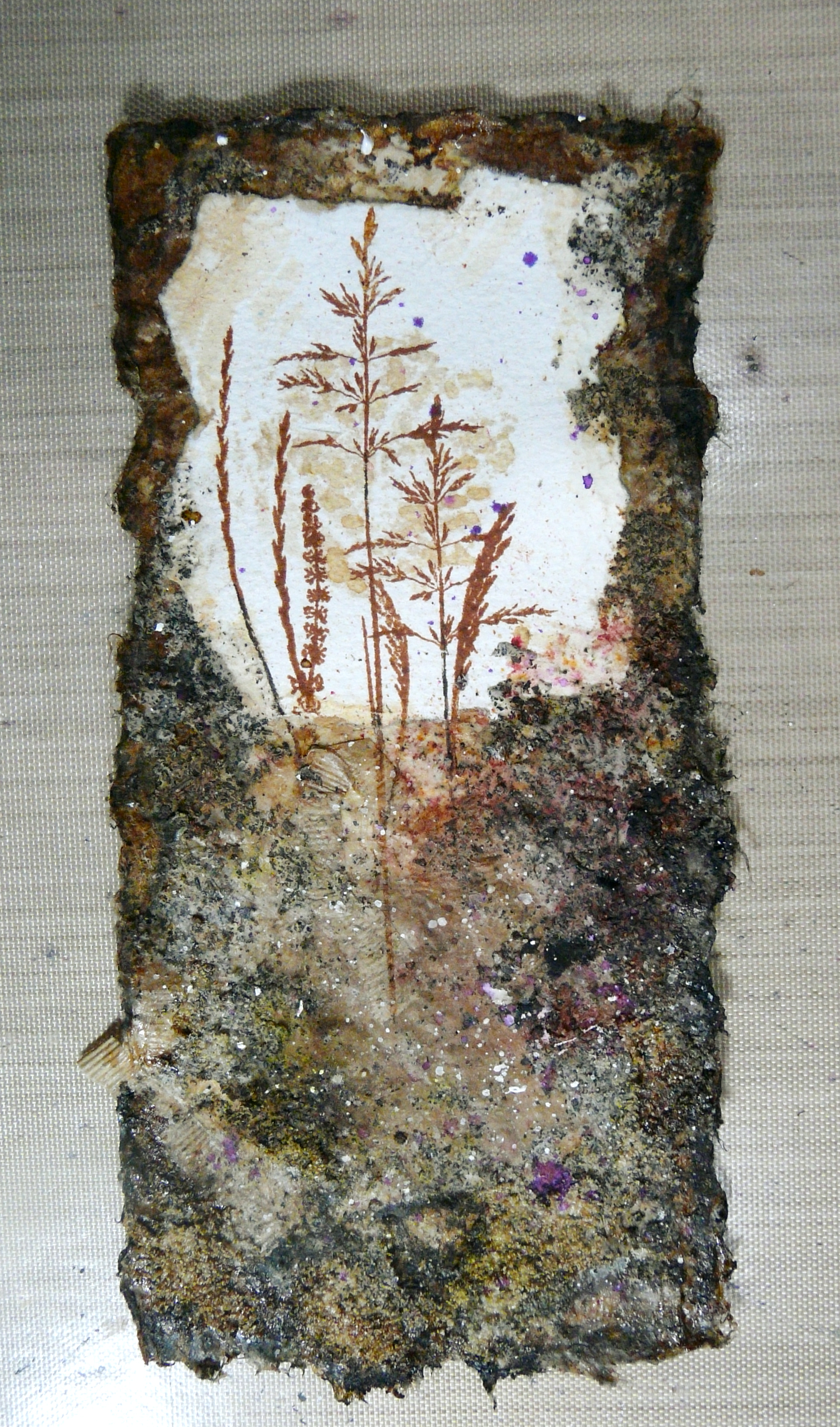
This was the result.

Originally I wasn’t going to put a sentiment on the outside of the card, but there needed to be something to balance the design, so I decided to add one. I went through my pile of rejects and spares from my Infusions mini-album project and found this one that exactly complemented my design. I tore off the bottom and wrote the text using my Uniball white Signo marker pen, and then darkened the edges, especially along the white torn top edge, with tea. I stuck this to the front of the card with regular matte gel medium, dabbing carefully over the text to prevent the water-soluble white from smudging, and afterwards touching this up where necessary.

To create the card base, I cut a piece of heavy white card and softened the edges with some more tea.

Inside, again using my wonderful stamp platform, I stamped the sentiment with sepia archival ink, using the “Memorable Moments” stamp set from Stampin’ Up.

To add a bit of interest, I made a couple of wide brush strokes across this sentiment with tea, using the fan brush.

I assembled the card using Scotch Quick Dry Adhesive which is a really good strong wet glue.

The finished card.

My hubby loves it!

Here it is, side by side with the other card I made recently, for his birthday last week.


Sunday, 20 September 2015

Dylusions Mixed Media Get Well Card

THE BIG REVEAL, PART 9.

This is the final thing that I made for Shaz before she went into hospital – until I had heard from her hubby that she had received it, it had to remain under wraps! I now know that I can share it with you.

I made her a get well card using a combination of Dylusions sprays and my new Dylusions paints. The colours of the two types of media match beautifully.

15 Finished Card

I began with a scrap piece of card which I had used for mopping up Peacock Feathers distress ink and Vibrant Turquoise Dylusions spray. It ended up pretty crinkled and distorted but I thought it would flatten out OK.

01 Turquoise DI and Dylusions Smooshed BG

This is my honeycomb stencil laid over the top of the background piece.

02 BG with Stencil

Stencilling with Polyfilla One Fill (what our US cousins call joint compound) – a lot cheaper than artists’ moulding paste! I spread a little in random patches, using a palette knife, and scraped off any bits that looked messy, and then dried it with my heat gun.

03 Stencil with Polyfilla

The piece with the stencilled Polyfilla.

04 Stencilled Polyfilla

Lemon Zest Dylusions spray. A couple of quick bursts at the top, then spritzed with water and held up so it dripped down through the stencilling. Love the lime green it produces with the turquoise.

05 Spray and Drip with Dylusions Lemon Zest Spray

Repeating the process with Crushed Grape Dylusions spray. In each case I spritzed it with water to help it blend.

06 Spray, Drip and Spritz with Crushed Grape Dylusions Spray

Coarse sea salt added, and re-spritzed with water. I left this for a few minutes to react, and then dried it with my heat gun.

07 Sea Salt

The piece with the salt crystals removed. It creates gorgeous swirls and spots as the salt draws the wet ink towards itself.

08 Sea Salt Removed

The piece along with a couple of other pieces used to mop up inks from my craft mat. Fabulous backgrounds!

09 With Smooshed and Sprayed BGs

The addition of Treasure Gold gilding wax to the raised stencilled areas. I put on the barest minimum so that the colours would still show through.

10 Treasure Gold on Stencilling

Working on the base card, I began by coating it with a thin layer of gesso, using a foam brush, and then dried with my heat gun. The surface of the card is fairly absorbent, and the gesso prevents the paints sinking in, and helps them blend better.

11 Gesso on Base Card

The Dylusions paints, in Lemon Zest, Vibrant Turquoise and Crushed Grape. I used the Ranger mini-blending tools to apply them and blend them together, and after the first coat was dry, I applied another, and after each one, blended the colours using a baby wipe.

12 Dylusions Paints on Base Card

The finished base card. The colours do blend well together, creating new colours.

13 Base Card Complete

The stencilled piece stuck down onto the base card.

14 Topper on Base Card

I found this amusing quote online and printed it out on the computer, cut out the pieces and coloured them with Antique Linen distress stain because the white card I printed them on looked a bit stark. I stuck them down with Scotch Quick Dry Adhesive and outlined each one with rough lines with a gold gel pen. (After I had stuck them down I realised I should have used gel medium… dratted chemo brain!)

15 Finished Card

The inside of the card was inked with a selection of distress inks, using Inkylicious Ink Dusters, to echo the colours on the front of the card. Starting at the top left corner and working around clockwise, Seedless Preserves, Peacock Feathers, Peeled Paint and Squeezed Lemonade, Spiced Marmalade and Aged Mahogany. The centre of the card still looked rather white and stark, so I added some Antique Linen distress ink to tone it down.

16 Inking the Inside

I unscrewed the lid of my water spritzing bottle and flicked the tube over the surface of the card to spatter it with water droplets. I left it to soak in for a few minutes and then blotted it off with kitchen paper to leave the white spots, to create a bit of texture.

17 The Inside Spattered

The final step was to add the sentiment, which was printed from the computer, coloured with Antique Linen distress stain, stuck down and outlined as before.

18 The Inside Complete

The backs of my cards usually seem to get a bit messy (I’m sure other people manage to keep the backs of theirs nice and pristine and clean, but I’ve never worked out how to do this!) and we are told that if you make a mistake, make a feature of it, so I did!

19 Messy Back

I inked the envelope to echo the colours of the card and its inside, and added the water spattering for a bit of texture.

I hope this card cheers her up in hospital, and at least raises a smile, if not a laugh! She loves very loud heavy rock music and I was delighted when I found that quote on Pinterest, and knew I had to use it for this card!!

Many of us on WOYWW have been following Shaz’s amazing progress in hospital as her hubby writes a daily diary on his blog. We continue to wish her well, and so look forward to the time when she is well enough to join us again. Meantime, take care, Shaz, and get well soon! We miss you.

Tuesday, 15 September 2015

Purple Stuff

For the first time for ages, I felt well enough to spend a little while in my ARTHaven doing something creative! This morning I actually managed to tidy up in there, and it really needed it, as it had become a dumping ground again. After that I was too tired to do any more, and had a visitor this afternoon, but this evening I decided to make a start on a project I’d had in mind for a while.

Our neighbour had an accident a few weeks ago and when she first came home, I wasn’t well enough to make her a get-well card but decided better late than never! I wanted to make her one of my lavender sachets in a little box, as I did for my fellow chemo-ites when I first started my treatment. This is what I have made.

18 Completed Box Closed 2

As well as making her a get-well card, I also have a couple of other cards to make, and decided to do it all as one project. Ages ago I was given some stash by somebody, which included this rather uninteresting pink and purple paper with flowers and butterflies on it – it’s fairly heavy paper but not quite thick enough to be called card, and in my opinion extremely dull, which is why I haven’t yet used it! I thought now was the time to get it out of my stash and on the move, so with a bit of alteration I was sure it could be improved.

01 Patterned Papers

I sprayed the first sheet with Crushed Grape and Bubblegum Pink Dylusions spray inks.

02 First Spray with Dylusions

Blotting off with the second sheet.

03 Blotting Off onto Second Sheet

Both sheets blotted and dried.

04 First 2 Sheets Dried

Preparing to spray the third sheet, this time with Crushed Grape and London Blue Dylusions spray inks.

05 Third Sheet Ready to Spray

The sheet sprayed.

06 Third Sheet - 1st Spray

After spritzing and blotting off, it joined the first two sheets, dried and completed. The pale pink one (which had had flowers punched out of it) was also spattered with water droplets and blotted off.

07 Three Sheets Sprayed

I took the darker sheet with butterflies on it (which had been so covered up with ink that they were now extremely subtle! – i.e. virtually invisible!) and stuck it down onto a sheet of plain white card with spray adhesive to thicken it up a bit and make it substantial enough to make a box. I used my box template to draw around, and cut out the shape.

08 Box Piece Outside

Here is the reverse side ready for inking with distress inks.

09 Box Inside Ready for Inking

I used the two paler colours (Shaded Lilac and Salty Ocean) to go all over it first, using Inkylicious Ink Dusters. I wasn’t too bothered about getting a very smoothly blended finish because it would be covered up later.

10 Box Inside - First Inking

Preparing to stamp with Versamark and heat emboss with clear embossing powder to act as a resist.

11 Box Inside Ready for Stamping

After the butterflies were stamped, and preparing for the second inking.

12 Box Inside Stamped and Ready for 2nd Inking

After the second inking with the darker shades, and buffed to clean the ink off the embossed butterflies, which now revealed the lighter shades of the first inking.

13 Box Inside Complete

Preparing to gold-emboss the outside of the box. This stamp set is Tim Holtz’s Bitty Grunge set of background stamps – unfortunately the corner of the box is across the name of the set!

14 Box Outside Ready for Stamping

After gold embossing. I wanted a nice random, mottled effect.

15 Box Outside Gold Embossed

The final step was to go around the outline with my gold Uniball Signo pen.

16 Box Outside Outlined with Gold Marker

The completed box, closed.

17 Completed Box Closed 1

Partially open.

19 Completed Box Half Open

Unfortunately with all the heating involved during the embossing process front and back, the layers started to come apart a bit, which wasn’t helped by the flexing of the flaps to close up the box, and you can see a slight crease on the flap that is open in the above photograph. Before finally assembling the box I ran over it vigorously with my brayer again, and I hope it’s going to stay stuck together!

Here is the box fully opened.

20 Completed Box Fully Open

I shall use the rest of the paper to make some cards, which will be part of this ongoing “Purple Stuff” project. Watch this space!

Related Posts Plugin for WordPress, Blogger...