Showing posts with label Peel-offs. Show all posts

Tuesday, 18 December 2018

Completion of the Mystery Project–Part 4–Purple Heart and Card

The final one of the three hanging hearts was the purple one, for my friend’s birthday, and I gave it to her a couple of days ago, together with a matching birthday card.

Some time ago she had asked me to make her something like this, and at the same time she gave me some pieces of wallpaper she’d got when she was deciding how to decorate her room. I decided to use bits from these for this project.

03 Selection of Wallpapers

For the background for this heart, I cut a piece of music to fit in the recess of the frame – my friend is a musician, and she had got me a whole lot of old music from someone she knows, and I’ve had this a while now, ready for incorporating into art projects.

01 Old Music from Alan Wills

The particular piece I used was from the back of one of the books of music, showing samples of other books – the music was reduced in size and just perfect for this little frame.

01 Cutting the Music and Wallpaper

I selected a few of the stems from one of the wallpaper pieces and fussy-cut them out to overlay on top of the music piece.

02 Music and Wallpaper Cut

The stems stuck down and the ends trimmed.

03 Wallpaper Pieces Stuck to Music

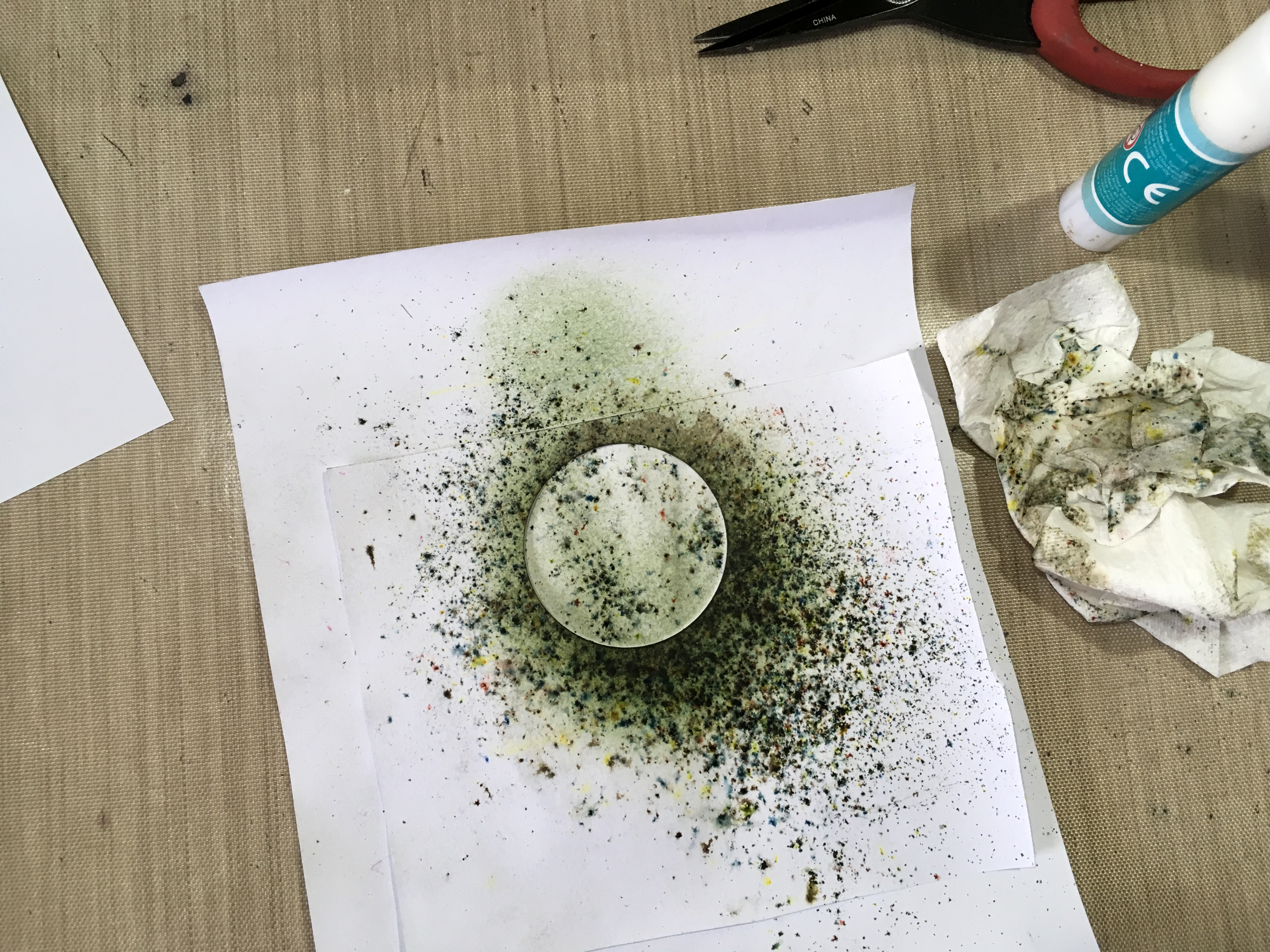
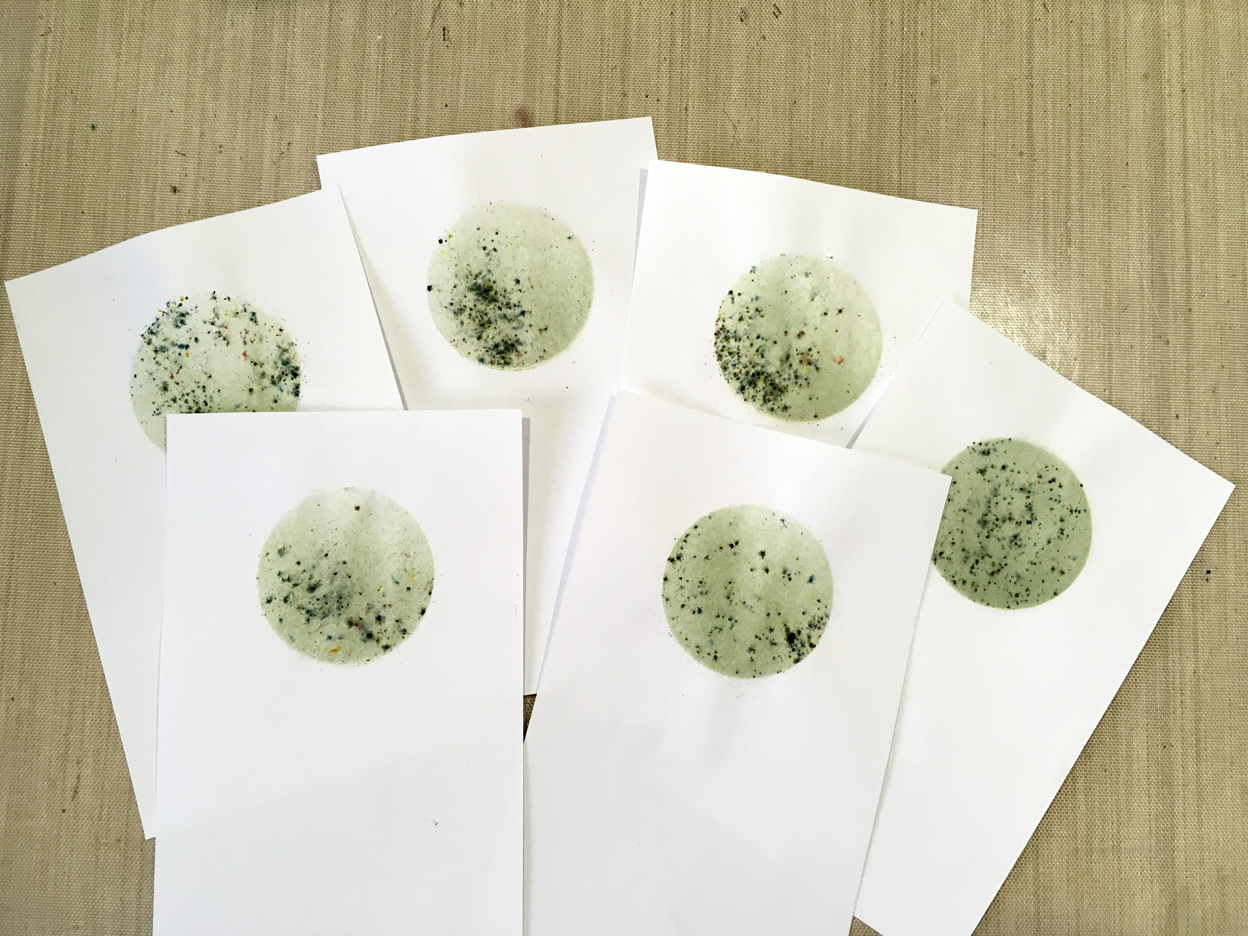
The music paper had a slightly greenish tinge to it, so I enhanced this by distressing the edges with some Pine Needles Distress Ink to start with.

04 Inking the Music - Pine Needles DI

To this I added some Pumice Stone and Hickory Smoke Distress Inks to dull it down a little.

05 The Music Inked

The music piece with its stems in place in the heart frame.

06 The Music in the Heart

I worked on the back as before, packing out the recess in the frame with corrugated cardboard stuck down with masking tape, and making a back piece traced around the outside of the heart onto a piece of cardboard. I distressed the edges with Pine Needles and Pumice Stone Distress Inks.

07 Working on the Back

Pumice Stone is a very useful colour. It’s not particularly inspiring on its own on a white background, but for dulling down other colours, it’s perfect.

These are the purple roses that I made for this frame, laid on a couple of the wallpaper pieces as a background.

25 All the Purple Roses on Silver Wallpaper

26 All the Purple Roses on Light Rose Wallpaper

Finally, here they are on the dark rose wallpaper. I really liked the spray of flowers on this paper and decided to use it for her birthday card (see below).

24 All the Purple Roses on Dark Rose Wallpaper

Here are the roses stuck onto the heart frame with hot glue. I have laid a few small flower pieces in place as I felt it needed something extra.

08 The Roses on the Heart

Inking the small flower pieces, using Seedless Preserves Distress Stain. On some of them, I also added a little Brushed Pewter Distress Stain for a bit of variety.

09 Inking the Tiny Flowers

I made some die-cut leaves and coloured them with Pine Needles and Forest Moss Distress Stains. I hand-embossed these when they were dry.

10 Inking the Leaves

Here are the finished leaves with the tiny purple flowers. The colour has come out a bit too bright on this black leather background! The true colour can be seen in the next photo.

49 Green Leaves and Tiny Purple Flowers

Here is the finished heart frame with some of the leaves added, also stuck down with hot glue, first of all against the stems wallpaper as a background:

11 Completed Heart 1

and on another of the wallpaper pieces for a slightly different effect.

12 Completed Heart 2

The Birthday Card

I wanted this to co-ordinate with the heart frame, and I particularly loved the dark rose wallpaper and decided to use this for the card.

I selected the area with a complete flower spray, and also cut out some of the rose leaves from elsewhere on the piece. These didn’t need embossing because they were slightly curled, and there was shading in the printing of the leaves. I cut the piece with the floral spray to the correct size to mat and layer onto a black cardstock base.

01 Cutting the Wallpaper Pieces

The bottom left hand corner of the piece had part of a very large rose on it, which I didn’t want, so I cut a piece of background from the wallpaper to cover it, and then found a small paper doiley in my stash, which I inked with Worn Lipstick, Pumice Stone and Hickory Smoke Distress Inks, gradually building up the colour with Inkylicious Ink Dusters until I’d got the colour right to co-ordinate with the background piece. I trimmed off the excess so that it would fit over the corner of the piece.

02 Inking the Doiley

The doiley glued in place over the piece of wallpaper background. Much better without that large rose.

03 The Doiley Glued in Place

Matting the piece onto the black card base. You can see that there are some leaves printed on the top edge – I was originally going to cut these off but decided against it. I love the “crazy paving” texture of the background of the wallpaper, which is slightly shiny.

04 Matting the Card

The next step was to glue on the leaves. I did a mock-up to decide where to place the die-cut and embossed leaves and stuck those down first. I took the rose leaves cut from the wallpaper and filled the backs with quite a bit of hot glue so that they would retain their slight curve, and let them cool till set. I wanted the leaves to have some dimension on the card and not just be glued down flat, but the paper was fairly flimsy, so the hot glue had the effect of strengthening them considerably.

05 Glueing on the Leaves

I placed them onto the card and heated them with my heat gun in order to soften the hot glue again and hold them in place.

06 The Leaves Glued in Place

Unfortunately this had the effect of warping the whole card, so it had to endure Shoshi’s Heavy Books Treatment overnight! It was much better in the morning.

I made a liner for the inside from some pink cardstock which I distressed with Dusty Concord Distress Ink, and stamped the sentiment with the same Distress Ink. I highlighted this with a pearlescent gel pen but this doesn’t show on the photo.

08 The Card Inside

The completed card, on one of the wallpaper pieces as a background. I added a gold peel-off sentiment.

07 The Finished Card

Here it is, with the purple hanging heart ornament which was her birthday present.

09 The Card and Present

This completes the mystery project of three hanging heart ornaments and a birthday card. I really like the colour schemes and the wallpaper pieces, and have enough left of these, and some of the flowers (I used all the purple flowers) to alter the little frames my hubby gave me recently.

01 Four Small Frames for Altering

They are a bit bigger than the small heart frames, so I’ll have a bit more space to play with. Watch this space.

I have enjoyed working with the wallpaper pieces. I have a couple of old wallpaper sample books and really should start using these. They can make a good starting point for many projects, and they have lovely designs, colours and textures which can be enhanced by the addition of embellishments. Must do more of this!

Thursday, 24 May 2018

Wood Effect Anniversary Card

Today is our 32nd wedding anniversary. Where did the years go?

Having been so ill recently, I only managed to give my hubby a bought card for his birthday, and that was bought for me by a friend! I thought I’d better push the boat out a bit and make an effort and make a nice card for him for our anniversary.

At the County Show last Friday I was fascinated by a little wooden tag attached to the most expensive chopping board (if it hadn’t been for the price I’d have bought it because I fell in love with it!) – the little tag was made of laser cut veneer, and as soon as I saw it, I knew I could make something similar in card, and this would be the basis for my hubby’s card.

I began in Inkscape, working on my Apple Mac which is connected to the Cougar cutting machine (called Sheba). I found a free svg file online of nesting hearts, and I cut a dozen heart-shaped frames using two of the nesting sizes – unfortunately I forgot to photograph these till it was too late, but this is the paper left after they had been cut out. I ended up with a dozen smaller hearts (the bits that fell out of the frames) and most of these will go in my stash for other projects. In this photo you can also see the A4 piece with a window cut out for the front of the card.

I seem to end up using American Cardstock card for most of my cutting projects because it cuts like a dream. However, it’s not quite robust enough for a card base with lots of embellishments so this would have to be reinforced later on.

Again, I kept forgetting to photograph my progress. For the front and back of the tag I cut two hearts the same size as the outside of the frame, and these pieces also had our initials cut in them, as well as some little geometric flower petals like on the tag at the show. Propped up against the paint pot, you can see the completed frame, and the thickness I was able to achieve by laminating several layers of card together. When the edges were painted they looked like a bit of plywood! See below for the painting technique to replicate woodgrain.

The initials on the right were the pieces that fell out when I cut them from the hearts, and would be used to embellish the inside of the card.

I had intended to leave the initials in the hearts hollow as well as the petals, but you could see through and the one on the reverse was confusing, so to overcome this problem I stuck a small square of gold card on the back of each piece, so that the initials were gold, and opaque.

I glued the frame pieces stacked together to give a laminated and more rigid frame for the embellishment. In this picture you can see the linen carpet thread I used to suspend the embellishment, and the two heart pieces (front and back) ready to be attached to the frame.

Here is the first piece attached to the frame, with it’s little square of gold card glued on, to make the initial solid, and the hanging thread.

Here is the finished tag, with the side with my hubby’s initial on the left, and mine on the right.

I am so pleased with this little heart embellishment – it reminds me of some olive wood Christmas tree decorations I’ve got. I think one could take this idea further and make them in different shapes. They have a Scandinavian or Eastern European feel to them. I’ve wanted to make something like this for ages and thought of using mounting board but this is too thick to cut with Sheba, and you couldn’t cut them by hand. The laminated frame idea works well, or one could just laminate solid shapes. You could still have a design pierced through. They might make nice little Christmas gifts, or perhaps wedding favours.

Moving on to the card base, I painted the whole of the front with beige fluid acrylic, and then with Desert Sands Infusions, taking care to paint broad vertical strips to represent the wood grain, as I did on the heart pieces.

Turning to the inside, I created another type of woodgrain background, this time with Distress Stains, to make a lighter background as a contrast. Normally I don’t much like the unevenness you get with these (the dauber bottle isn’t my favourite form of delivery) but for woodgrain the effect is ideal. I used a combination of Antique Linen and Old Paper. This is the technique I used for one of the pages in my Floral Mini Album.

Here is the main card base, and the piece I cut and coloured with Distress Stains to be stuck on the back of the card front. The hanging string would be sandwiched between these two layers. You can also see the two thin circles I cut from gold card, to frame the hole, both front and back, to give a nice finish to the card.

Here are all the materials I used to create the embellishments inside the card. I used a couple of the hearts cut from the middles of the frame pieces, and coloured them to look like wood, as for the front of the card, but this time, to add a bit of bling, I also added a light touch of Treasure Gold (gilding wax). For the sentiments I simply used some peel-offs that I’ve had in my stash for years. They were very small, but I like the effect of the gold on the woodgrain, and I didn’t want anything competing with the rest of the design.

The edges of the hearts were distressed, and they were glued together and stuck down, and some shading added. The initials were what was cut out of the front and back of the embellishment. I daubed them with Antique Linen and Old Paper Distress stains, and they also had a light dusting of Treasure Gold.

I cut a piece of plain white card and stuck it to the back of the card base for extra rigidity. Even though it was just the back, I distressed the edges with Gathered Twigs Distress Ink to take away the starkness of the white card.

Here is the finished card lying flat.

Here it is standing, so that you can see how the embellishment turns and moves as it hangs freely in the aperture of the card.

The completed inside of the card. You can see the embellishment through the aperture of the card.

I think this faux wood effect has come out very well. When I  have used Infusions in this way before (see this post for an example), I used Desert Sands Infusions straight onto white card, and it came out very orange – not a problem if you want it that way, but I wanted a more subtle approach here, so I used the Infusions on a painted substrate. You could make faux woodgrain in this way with any colour you wanted really.

Another reason I like this effect is that it is very suitable for a card for a man. It is strong and more sombre but it also has a natural effect. I used a similar theme on my hubby’s anniversary card in 2016, but this time with a woodgrain effect created with an embossing folder.

I seem to be in a bit of a brown phase again at the moment, after the bright colours of the Floral Mini-Album! I can’t wait to try replicating the effect of the absolutely fabulous wooden moths I saw at the County Show…

Monday, 16 October 2017

Card Factory 2017

My stash of cards had pretty well run out so I really had to get down to making some more. I’ve decided I don’t really enjoy card making that much, so it’s a bit of a chore but I haven’t quite got to the stage when I’ve given up altogether and resorted to buying them!

Rather than falling into my usual trap of turning each card into a major work of art and taking far too long over it, I kept these ones simple. I shall continue to make special cards when the occasion demands, but the limited time I have available to spend in the studio (dictated by busyness elsewhere, and being too fatigued to do anything) is now dedicated to art projects I actually want to do, such as mixed media, books, experimenting with materials, etc.

Today I made seven cards. Six were more or less identical and were on a production line basis, and the other was a one-off which I made for our neighbour whose birthday is today.

I really struggled with these! Such a simple project, but if anything could go wrong, it did… I was feeling a bit brainfogged which really doesn’t help, and I made quite a few mistakes which were not able to be remedied unless I started again, so I pressed on. As a result, they are not my best effort!

I began by making a circular mask. Rather than setting the cutting machine up (couldn’t be bothered – too tired!!), I cut a 2-inch circle with a punch, which of course had to cut quite near the edge of the paper, so I stuck this with a glue stick to a larger piece, out of which I had cut a rough circle, larger than the punched circle. This is the back of it.

Turning it over, it provided enough margin not to allow anything to stray beyond the edges.

I had a couple of abortive attempts. I sprinkled Infusions (The Sage from set 1) through the mask onto two of the sheets I’d cut for the card toppers. In order to get enough coverage, they came out much too dark to stamp on. The one on the right was slightly lighter, and I thought I’d run over it lightly with a wet brush to make the texture smoother, but this was a disaster. Bin time.

It was hard to know what order to post the photos in, because in order to photograph the process I went through, I had to get ahead of myself a bit – I used the first successful circle as a guide for the rest. Here it is on my light panel, ready to use as a guide.

I lined up the next sheet over it, and you can just see the circle showing through.

I was then able to lay the mask on top. I had to do it this way because the mask was bigger than the small sheet and I had no way of lining it up otherwise.

I’d decided the only way I could get the effect I wanted, with good coverage of colour but with a little of the Infusions texture, was to ink the circle first with distress ink using an Ink Duster (I used Bundled Sage), and then add the absolute minimum of Infusions on top. This worked well.

Here is the distress ink going on, through the mask.

I picked up the whole thing and without disturbing it, carried it back to my main work area and sprinkled on the Infusions through the mask.

I spritzed it lightly with water without moving the mask.

I left it to stand for a minute or two and then blotted it off.

Finally, I removed the mask and dried it with my heat gun.

Here are the finished circles.

The problem was, I should have cut these pieces from card, and not from paper. The paper didn’t stand up too well to getting wet, and it buckled a bit.

I got out a selection of stamps, to choose which designs I wanted to use.

Using my wonderful new stamp platform, I stamped a single image onto each circle, using black archival ink.

This flower head one didn’t have a stem – you could use one of the stem stamps from the set but it meant setting it up on the stamp platform, and I thought it would be simpler just to draw one in with a black marker pen afterwards.

I have always been hopeless at stamping. The stamp platform is a marvellous tool for someone like me, but would you believe it… Only Shoshi could mess up a stamped image using a stamp platform!!! On the one in the next photo, the impression wasn’t quite good enough so I did it again, not realising that because I’d used paper instead of card, on the first impression the stamp stuck slightly and the paper moved fractionally when I lifted the lid of the platform. When I did the second impression, I got a doubled, blurred image! Grrrrrr. The tree branches weren’t too bad and I could get away with that, but the base part looked a mess. I blended it out with my alcohol pen and managed to salvage it!

Here are the other completed stamped images.

Finally, I matted and layered the toppers onto A4 white card folded to A5. Again, I experienced problems because the paper I’d used for the toppers was too thin, and I got a bit of buckling and creasing when I layered them, so the finish isn’t that great…

The final step was to stamp the sentiment on the bottom. I used my green archival ink for that, and again used the stamp platform.

One single finished card, which shows what this stamped image should look like when you don’t go and blur it!

I actually made our neighbour’s card before I did the set, and I should have inked first with distress ink and then added less Infusions, which would have given a better result, but you live and learn!

I began by taking a mask from my stash. Some time ago I made a card with lots of butterflies and frames on it, and had a frame-shaped piece of card with six butterflies cut out of it on the cutting machine. I laid this down on top of the card base and sprinkled Infusions over it (Violet Storms from set 1).

This is the finished card. I didn’t really like it much as the outlines were a bit blurred. I went around the outside of the frame and butterflies with my white marker pen, and then defined the wings of the butterflies with a silver glitter pen and the addition of some stickles.

The final step was to add a silver peel off for the sentiment, and this doesn’t show up very well! Not a great effort.

Why do I find cards so unsatisfying to make?? Perhaps if I enjoyed doing them more, I’d do them better!


PS Today is the second anniversary of the day I finished my chemo! Where on earth has the time gone?

Related Posts Plugin for WordPress, Blogger...